As a Windows user, you're accustomed to seeing controls like buttons, list boxes, menus, and edit boxes. As Windows developed, however, Microsoft noticed that developers routinely created other types of controls in their programs. These controls included toolbars, status bars, progress bars, tree views, and others. To make life easier for Windows programmers, Microsoft included these popular controls as part of the Windows 95 operating environment (and the latest version of Windows NT). Now, Windows programmers no longer need to create their own versions of these controls from scratch. This chapter introduces you to many of Windows 95's common controls. The toolbar and status bar controls are covered in Chapter 10, "Status Bars and Toolbars," and property sheets and wizards are covered in Chapter 12, "Property Pages and Sheets and Wizards."
Progress bars provide feedback to the user about the status of a long operation.
Slider controls (also known as trackbars) enable users to select values within a given range.
Up-Down controls (or spinners) are another way a user can specify a value from a given range.
Many Windows 95 controls use a set of images. An Image List holds those images.
List View controls provide a configurable view of items in a data set.
Tree View controls display a hierarchical view of data elements.
Rich Edit controls enable you quickly to add word-processing capabilities to your application.
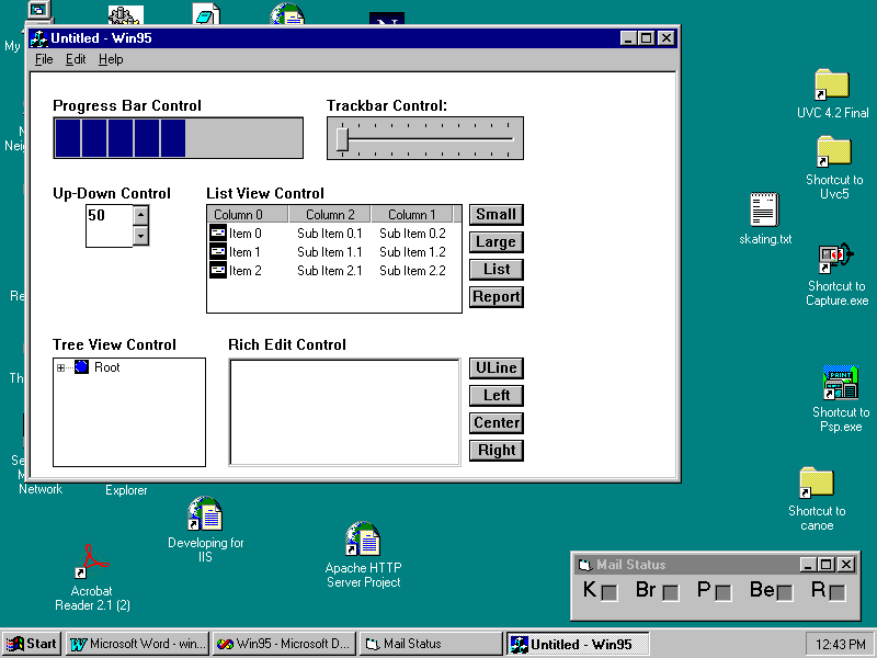
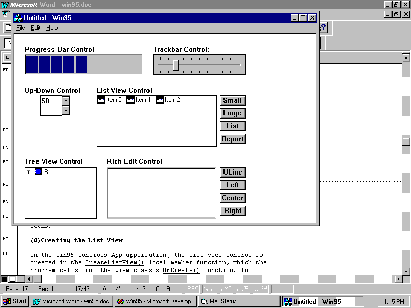
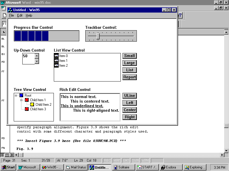
This chapter's sample program is called Win95 Controls App. It demonstrates six of the Windows 95 common controls: the progress bar, the slider, the up-down control, the list view, the tree view, and the rich edit control, all of which are shown in Figure 3.1. In the following sections, you learn the basics of creating and using these controls in your own applications. Because this sample application uses some techniques that have not yet been covered, the sample program is presented as a demonstration rather than as a build-along project. You should open the code in Developer Studio and look through it as you read.
Fig. 3.1 The Win95 sample application demonstrates six Windows 95 common controls.
The controls themselves are declared as data members of the view class, by adding the lines in Listing 3.1 to Win95View.h. As you can see, the progress bar is an object of the CProgressCtrl class. It is discussed in the next section. The other controls will be discussed in later sections of this chapter.
Listing 3.1ó Win95View.hóDeclaring the Controls
protected:
//Progress Bar
    CProgressCtrl
m_progressBar;
//Trackbar or Slider
CSliderCtrl m_trackbar;
BOOL m_timer;
 //
Up-Down or Spinner
CSpinButtonCtrl m_upDown;
CEdit m_buddyEdit;
// List View
CListCtrl m_listView;
CImageList m_smallImageList;
CImageList m_largeImageList;
CButton m_smallButton;
CButton m_largeButton;
CButton m_listButton;
CButton m_reportButton;
 // Tree
View
CTreeCtrl m_treeView;
CImageList m_treeImageList;
// Rich Edit
CRichEditCtrl m_richEdit;
CButton m_boldButton;
CButton m_leftButton;
CButton m_centerButton;
CButton m_rightButton;
Probably the new common control that is easiest to use is the progress bar, which is nothing more than a rectangle that slowly fills in with colored blocks. The more colored blocks filled in, the closer the task is to being complete. When the progress bar is completely filled in, the task associated with the progress bar is also complete. You might use a progress bar to show the status of a sorting operation or to give the user visual feedback about a large file that's being loaded.
To see a progress bar in action, click anywhere in the background of Win95 Controls App's window. When you do, the progress bar begins filling with colored blocks. When the progress bar is completely filled, it starts over again. This continues until you click the window again or exit the program. Of course, in this program, the progress bar isn't tracking a real task in progress. It's simply responding to timer messages. The program does, however, still demonstrate how you might use a progress bar in your own applications.
Creating the Progress Bar
Before you can use a progress bar, you must create it. Often in an MFC program, the controls are created as part of a dialog box. However, Win95 Controls App displays its controls in the application's main window, the view of this Single Document Interface (SDI) application. You will learn more about documents and views in Chapter 5, ìDocuments and Views.î All of the controls are created in the view class OnCreate() function, which responds to the WM_CREATE Windows message.
Because creating and initializing each of the six controls requires quite a bit of code, the application delegates the details to separate functions. For example, to create the progress bar control, OnCreate() calls the CreateProgressBar() local member function, shown in Listing 3.2, like this:
CreateProgressBar();
Listing 3.2ó Win95View.cppóCWin95View::CreateProgressBar()
void CWin95View::CreateProgressBar()
{
    m_progressBar.Create(WS_CHILD | WS_VISIBLE |
WS_BORDER,
CRect(20, 40, 250, 80), this, IDC_PROGRESSBAR);
m_progressBar.SetRange(1, 100);
m_progressBar.SetStep(10);
m_progressBar.SetPos(50);
m_timer = FALSE;
}
CreateProgressBar() first creates the progress bar control by calling the control's Create() function. This function's four arguments are the control's style flags, the control's size (as a CRect object), a pointer to the control's parent window, and the control's ID. The resource ID, IDC_PROGRESSBAR, is added by hand. To add resource symbols to your own applications, choose View, Resource Symbols and click the New button. Type in a resource ID name, such as IDC_PROGRESSBAR, and use the default number Developer Studio provides.
The style constants are the same constants that you use for creating any type of window (a control is really nothing more than a special kind of window, after all). In this case, you need at least the following:
The WS_BORDER is a nice addition because it adds a dark border around the control, setting it off from the rest of the window.
Initializing the Progress Bar
After the progress bar control is created, it must be initialized. The CProgressCtrl class features a number of member functions that enable you to initialize and manipulate the control, as listed in Table 3.1.
Table 3.1óMember Functions of the CProgressCtrl Class
| Function | Description |
Create() |
Creates the progress bar control |
OffsetPos() |
Advances the control the given number of blocks |
SetPos() |
Sets the control's current value |
SetRange() |
Sets the control's minimum and maximum values |
SetStep() |
Sets the value by which the control advances |
StepIt() |
Advances the control by a one-step unit |
To initialize the control, CWin95View::CreateProgressBar() calls SetRange(), SetStep(), and SetPos().Because the range and the step rate are related, a control with a range of 1-10 and a step rate of 1 works almost identically to a control with a range of 1-100 and a step rate of 10.
When this demonstration application starts, the progress bar is already half filled with colored blocks. (This is purely for aesthetic reasons. Usually a progress bar begins its life empty.) It's half full because CreateProgressBar() calls SetPos() with the value of 50, which is the midpoint of the control's range.
Manipulating the Progress Bar
In Win95 Controls App, the progress bar starts counting forward when you click the window's background. This is because the program responds to the mouse click by starting a timer that sends WM_TIMER messages to the program two times per second. In the view class's OnTimer() function, the program makes the following function call:
m_progressBar.StepIt();
The StepIt() function increments the progress bar control's value by the step rate, causing new blocks to be displayed in the control as the control's value setting counts upward. When the control reaches its maximum, it automatically starts over.
Notice that there are no CProgressCtrl member functions that control the size or number of blocks that will fit into the control. This attribute is controlled indirectly by the size of the control.

Many times in a program you might need the user to enter a value within a specific range. For this sort of task, you use MFC's CSliderCtrl class to create a slider (also called trackbar) control. For example, suppose you need the user to enter a percentage. In this case, you want the user to enter values only in the range from 0 to 100. Other values would be invalid and could cause problems in your program.
By using the slider control, you can force the user to enter a value in the specified range. Although the user can accidentally enter a wrong value (a value that doesn't accomplish what the user wants to do), there is no way to enter an invalid value (one that brings your program crashing down like a stone wall in an earthquake).
For a percentage, you create a slider control with a minimum value of 0 and a maximum value of 100. Moreover, to make the control easier to position, you might want to place tick marks at each setting that's a multiple of 10, providing 11 tick marks in all (including the one at 0). Win95 Controls App creates exactly this type of slider.
To see the slider work, click the slider's slot. When you do, the slider moves forward or backward, and the selected value appears to the right of the control's caption, as seen in Figure 3.1. As soon as the slider has the focus, you can also control it with your keyboard's Up and Down arrow keys, as well as with the Page Up and Page Down keys.
Creating the Trackbar
In CWin95View, the slider is created in the CreateTrackbar() local member function shown in Listing 3.3. Like CreateProgressBar(), this function is called from CWin95View::OnCreate().
Listing 3.3óWin95View.cppóCWin95View::CreateTrackBar()
void CWin95View::CreateTrackbar()
{
    m_trackbar.Create(WS_CHILD | WS_VISIBLE |
WS_BORDER |
TBS_AUTOTICKS | TBS_BOTH | TBS_HORZ,
CRect(270, 40, 450, 80), this, IDC_TRACKBAR);
m_trackbar.SetRange(0, 100, TRUE);
m_trackbar.SetTicFreq(10);
m_trackbar.SetLineSize(1);
m_trackbar.SetPageSize(10);
}
As with the progress bar, the first step is to create the slider control by calling its Create() member function. This function's four arguments are the control's style flags, the control's size (as a CRect object), a pointer to the control's parent window, and the control's ID. The style constants include the same constants that you would use for creating any type of window, with the addition of special styles used with sliders. Table 3.2 lists these special styles.
Table 3.2óSlider Styles
| Style | Description |
TBS_AUTOTICKS |
Enables the slider to automatically draw its tick marks |
TBS_BOTH |
Draws tick marks on both sides of the slider |
TBS_BOTTOM |
Draws tick marks on the bottom of a horizontal slider |
TBS_ENABLESELRANGE |
Enables a slider to display a sub-range of values |
TBS_HORZ |
Draws the slider horizontally |
TBS_LEFT |
Draws tick marks on the left side of a vertical slider |
TBS_NOTICKS |
Draws a slider with no tick marks |
TBS_RIGHT |
Draws tick marks on the right side of a vertical slider |
TBS_TOP |
Draws tick marks on the top of a horizontal slider |
TBS_VERT |
Draws a vertical slider |
Initializing the Trackbar
After the slider control is created, it must be initialized. The CSliderCtrl class features many member functions that enable you to initialize and manipulate the control. Those member functions and their descriptions are listed in Table 3.3.
Table 3.3óMember Functions of the CSliderCtrl Class
| Function | Description |
ClearSel() |
Clears a selection from the control |
ClearTics() |
Clears tick marks from the control |
Create() |
Creates a slider control |
GetChannelRect() |
Gets the size of the control's slider |
GetLineSize() |
Gets the control's line size |
GetNumTics() |
Gets the number of tick marks |
GetPageSize() |
Gets the control's page size |
GetPos() |
Gets the control's position |
GetRange() |
Gets the control's minimum and maximum values |
GetRangeMax() |
Gets the control's maximum value |
GetRangeMin() |
Gets the control's minimum value |
GetSelection() |
Gets the current range selection |
GetThumbRect() |
Gets the size of the control's thumb |
GetTic() |
Gets the position of a tick mark |
GetTicArray() |
Gets all of the control's tick positions |
GetTicPos() |
Gets the client coordinates of a tick mark |
SetLineSize() |
Sets the amount to move the value up or down in response to the cursor up or cursor down key |
SetPageSize() |
Sets the amount to move the value up or down in response to the page up or page down key |
SetPos() |
Sets the control's position |
SetRange() |
Sets the control's minimum and maximum values |
SetRangeMax() |
Sets the control's maximum value |
SetRangeMin() |
Sets the control's minimum value |
SetSelection() |
Sets a selected sub-range in the control |
SetTic() |
Sets the position of a tick mark |
SetTicFreq() |
Sets the control's tick frequency |
VerifyPos() |
Determines whether the control's position is valid |
Usually, when you create a slider control, you want to set the control's range and tick frequency. If the user is going to use the control from the keyboard, you also need to set the control's line and page size. In the Win95 Controls App application, the program initializes the trackbar with calls to SetRange(), SetTicFreq(), SetLineSize(), and SetPageSize(), as you saw in Listing 3.3. The call to SetRange() sets the trackbar's minimum and maximum values to 0 and 100. The arguments are the minimum value, the maximum value, and a Boolean value indicating whether the slider should redraw itself after setting the range. Notice the tick frequency and page size are then set to be the same: This isnít absolutely required, but itís a very good idea. Most people assume that the tick marks indicate the size of a page and you will confuse your users if the tick marks are more or less than a page apart.
Manipulating the Slider
A slider is just a special scrollbar control. When the user moves the slider, the control generates WM_HSCROLL messages, which Win95 Controls App captures in its view class's OnHScroll() member function, as shown in Listing 3.4.
Listing 3.4óWin95View.cppóCWin95View::OnHScroll()
void CWin95View::OnHScroll(UINT nSBCode, UINT nPos, CScrollBar* pScrollBar)
{
    CSliderCtrl*
slider = (CSliderCtrl*)pScrollBar;
int position = slider->GetPos();
char s[10];
    wsprintf(s, "%d   ",
position);
CClientDC clientDC(this);
clientDC.TextOut(390, 22, s);
    CView::OnHScroll(nSBCode, nPos,
pScrollBar);
}
Looking at this code, you see that the control itself doesnít display the current position as a number nearby; itís the OnHScroll() function that displays the number. Hereís how it works:
OnHScroll()'s fourth parameter is a pointer to the scroll object that generated the WM_HSCROLL message.
The function first casts this pointer to a CSliderCtrl pointer, then it gets the current position of the trackbar's slider by calling the CSliderCtrl member function GetPos().
After the program has the slider's position, it converts the integer to a string and displays that string in the window.
See ìDrawing on the Screenî to learn how to make text appear on the screen. (Ch. 6)
The trackbar control isn't the only way you can get a value in a predetermined range from the user. If you don't need the trackbar for visual feedback, you can use an up-down control, which is little more than a couple of arrows that the user clicks to increase or decrease the control's setting. Typically an edit control next to the up-down control, called a buddy edit control or justa buddy control, displays the value to the user.
In the Win95 Controls App application, you can change the setting of the up-down control by clicking either of its arrows. When you do, the value in the attached edit box changes, indicating the up-down control's current setting. After the control has the focus, you can also change its value by pressing your keyboard's Up and Down arrow keys.
Creating the Up-Down Control
In the Win95 Controls App application, the up-down control is created in the CreateUpDownCtrl() local member function, which the program calls from the view class's OnCreate() function. In CreateUpDownCtrl(), as shown in Listing 3.5, the program creates the up-down control by first creating the associated buddy control to which the up-down control communicates its current value.
Listing 3.5óWin95View.cppóCWin95View::CreateUpDownCtrl()
void
CWin95View::CreateUpDownCtrl()
{
m_buddyEdit.Create(WS_CHILD | WS_VISIBLE | WS_BORDER,
        CRect(50, 120, 110, 160), this,
IDC_BUDDYEDIT);
m_upDown.Create(WS_CHILD | WS_VISIBLE | WS_BORDER |
UDS_ALIGNRIGHT | UDS_SETBUDDYINT | UDS_ARROWKEYS,
CRect(0, 0, 0, 0), this, IDC_UPDOWN);
m_upDown.SetBuddy(&m_buddyEdit);
m_upDown.SetRange(1, 100);
m_upDown.SetPos(50);
}
In most cases, including this one, the buddy control is an edit box, created by calling the CEdit class's Create() member function. This function's four arguments are the control's style flags, the control's size, a pointer to the control's parent window, and the control's ID. If you recall the control declarations, m_buddyEdit is an object of the CEdit class.
Now that the program has created the buddy control, it can create the up-down control in much the same way, by calling the object's Create() member function. As you can probably guess by now, this function's four arguments are the control's style flags, the control's size, a pointer to the control's parent window, and the control's ID. As with most controls, the style constants include the same constants that you use for creating any type of window. The CSpinButtonCtrl class, of which m_upDown is an object, however, defines special styles to be used with up-down controls. Table 3.4 lists these special styles.
Table 3.4óUp-Down Control Styles
| Styles | Description |
UDS_ALIGNLEFT |
Places the up-down control on the left edge of the buddy control |
UDS_ALIGNRIGHT |
Places the up-down control on the right edge of the buddy control |
UDS_ARROWKEYS |
Enables the user to change the control's values using the keyboard's Up and Down arrow keys |
UDS_AUTOBUDDY |
Makes the previous window the buddy control |
UDS_HORZ |
Creates a horizontal up-down control |
UDS_NOTHOUSANDS |
Eliminates separators between each set of three digits |
UDS_SETBUDDYINT |
Displays the control's value in the buddy control |
UDS_WRAP |
Causes the control's value to wrap around to its minimum when the maximum is reached, and vice versa |
After the up-down control is created, it must be initialized. The CSpinButtonCtrl class features member functions that enable you to initialize and manipulate the control, as listed in Table 3.5.
Table 3.5óCSpinButtonCtrl Member Functions
| Function | Description |
Create() |
Creates the up-down control |
GetAccel() |
Gets the control's speed |
GetBase() |
Gets the control's numerical base |
GetBuddy() |
Gets a pointer to the control's buddy control |
GetPos() |
Gets the control's position |
GetRange() |
Gets the control's minimum and maximum values |
SetAccel() |
Sets the control's speed |
SetBase() |
Sets the control's numerical base (10 for decimal, 16 for hex) |
SetBuddy() |
Sets the control's buddy control |
SetPos() |
Sets the control's position |
SetRange() |
Sets the control's minimum and maximum values |
This chapterís sample application establishes the up-down control with calls to SetBuddy(), SetRange(), and SetPos(). Thanks to the UDS_SETBUDDYINT flag passed to Create() and the call to the control's SetBuddy() member function, Win95 Controls App does not need to do anything else to have the control's value appear on the screen. The control handles its buddy automatically.
Often in programs you need to use images that are related in some way. For example, your application might have a toolbar with many command buttons, each of which uses a bitmap for its icon. In a case like this, it would be great to have some sort of program object that could not only hold the bitmaps, but also organize them so that they can be accessed easily. That's exactly what an image list control does for youóit stores a list of related images. You can use the images any way that you see fit in your program. Several Windows 95 controls rely on image lists. These controls are:
You will undoubtedly come up with many other uses for image lists. You might, for example, have an animation sequence that you'd like to display in a window. An image list is the perfect storage place for the frames that make up the animation, because you can easily access any frame just by using an index.
If the word index makes you think of arrays, you're beginning to understand how an image list stores images. An image list is very similar to an array that holds pictures rather than integers or floating-point numbers. Just as with an array, you initialize each ìelementî of an image list and thereafter can access any part of the ìarrayî by using an index.
You won't, however, ever see an image list control in your running application in the same way that you can see a status bar or a progress bar control. This is because (again, similar to an array) an image list is only a storage structure for pictures. You can display the images stored in an image list, but you can't display the image list itself. Figure 3.2 shows how an image list is organized.
Fig. 3.2 An image list is much like an array of pictures.
Creating the Image List
In the Win95 Controls App application, image lists are used with the list view and tree view controls, so the image lists for the controls are created in the CreateListView() and CreateTreeView() local member functions, which the program calls from CWin95View::OnCreate(). Youíll see those functions shortly, but because they are quite long, this section presents the two function calls that are relevant to the image list. It is created with a call to its Create() member function, like this:
m_smallImageList.Create(16, 16, FALSE, 1, 0);
The Create() function's five arguments are:
This last value is 0 to indicate that the list is not allowed to grow during runtime. The Create() function is overloaded in the CImageList class so that you can create image lists in various ways. You can find the other versions of Create() in your Visual C++ online documentation.
Initializing the Image List
After you create an image list, you will want to add images to it. After all, an empty image list isn't of much use. The easiest way to add the images is to include the images as part of your application's resource file and load them from there. For example, the following code shows how Win95 Controls App loads an icon into one of its image lists:
    HICON hIcon = ::LoadIcon
(AfxGetResourceHandle(),
MAKEINTRESOURCE(IDI_ICON1));
m_smallImageList.Add(hIcon);
Here, the program first gets a handle to the icon. Then, it adds the icon to the image list by calling the image list's Add() member function. You might create these icons by choosing Insert, Resource, double-clicking Icon, and then editing the new blank icon in the Resource Editor.
Table 3.6 lists other member functions you can use to manipulate an object of the CImageList class. As you can see, you have a lot of control over an image list if you really want to dig in.
Table 3.6óMember Functions of the CImageList Class
| Function | Description |
Add() |
Adds an image to the image list |
Attach() |
Attaches an existing image list to an object of the CImageList class |
BeginDrag() |
Starts an image-dragging operation |
Create() |
Creates an image list control |
DeleteImageList() |
Deletes an image list |
Detach() |
Detaches an image list from an object of the CImageList class |
DragEnter() |
Locks a window for updates and shows the drag image |
DragLeave() |
Unlocks a window for updates |
DragMove() |
Moves the drag image |
DragShowNolock() |
Handles the drag image without locking the window |
Draw() |
Draws an image that's being dragged |
EndDrag() |
Ends an image-dragging operation |
ExtractIcon() |
Creates an icon from an image |
GetBkColor() |
Gets an image list's background color |
GetDragImage() |
Gets the image for drag operations |
GetImageCount() |
Gets the number of images in the control |
GetImageInfo() |
Gets image information |
GetSafeHandle() |
Gets an image list's handle |
Read() |
Gets an image list from the given archive |
Remove() |
Removes an image from the image list |
Replace() |
Replaces one image with another |
SetBkColor() |
Sets an image list's background color |
SetDragCursorImage() |
Creates an image for drag operations |
SetOverlayImage() |
Sets the index of an overlay mask |
Write() |
Writes an image list to the given archive |
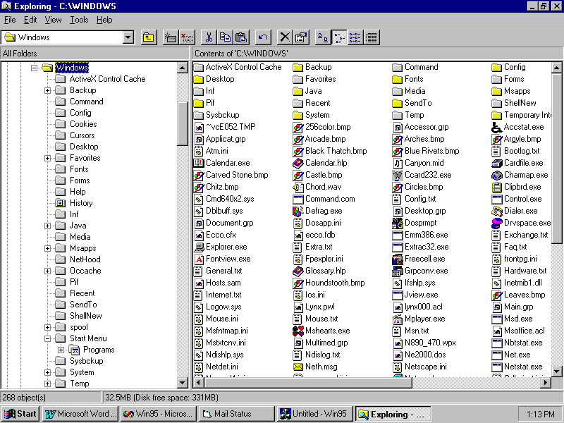
A list view control simplifies the job of building an application that works with lists of objects and organizes those objects in such a way that the program's user can easily determine each object's attributes. For example, consider a group of files on a disk. Each file is a separate object that is associated with a number of attributes including the file's name, size, and the most recent modification date. Windows 95 shows files either as icons in a window or as a table of entries, each entry showing the attributes associated with the files. The user has full control over the way that the file objects are displayed, including which attributes are shown and which are not listed. The Windows 95 common controls include something called a list view control, which enables Windows 95 programmers to organize lists exactly the same way that Windows 95 does with files and other objects.
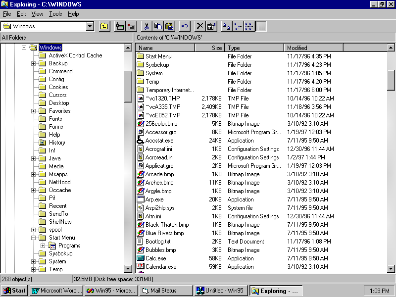
If you'd like to see an example of a full-fledged list view control, just open the Windows 95 Explorer (see Figure 3.3). The right side of the window shows how the list view control can organize objects in a window. (The left side of the window contains a tree view control, which you learn about later in this chapter, in the section titled "The Tree View Control.") In the figure, the list view is currently set to the report view, in which each object in the list receives its own line showing not only the object's name but also the attributes associated with that object.
Fig. 3.3 Windows 95 Explorer uses a list view control to organize file information.
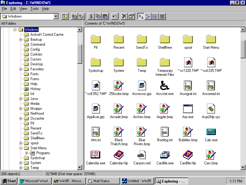
The user can change the way objects are organized in a list view control. Figure 3.4, for example, shows the list view portion of the Explorer set to the large-icon setting, whereas Figure 3.5 shows the small-icon setting, which enables the user to see more objects (in this case, files) in the window. With a list view control, the user can edit the names of objects in the list, and in the report view can sort objects based on data displayed in a particular column.
Fig. 3.4 Here's Explorer's list view control set to large icons.
Fig. 3.5 Here's Explorer's list view control set to small icons.
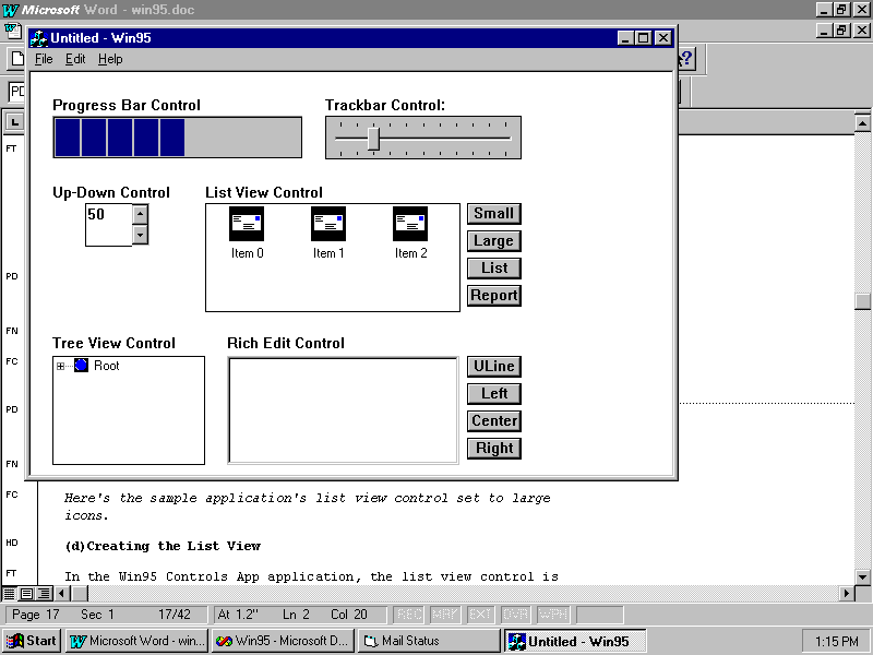
The Win95 Controls App application also sports a list view control, although it's not as fancy as Explorer's. To switch between the small-icon, large-icon, list, and report views, click the appropriate button to the right of the control. Figure 3.1 already showed you the report view for this list view. Figure 3.6 shows the application's list view control displaying small icons, whereas Figure 3.7 shows the large icons.
Fig. 3.6 Here's the example application's list view control set to small icons.
Fig. 3.7 Here's the sample application's list view control set to large icons.
Creating the List View
How does all of this happen? Well, it does require more work than the progress bar, trackbar, or up-down control (it could hardly take less.) In the Win95 Controls App application, the list view control is created in the CreateListView() local member function, as shown in Listing 3.6, which the program calls from the view class's OnCreate() function. CreateListView() performs the following tasks:
Creates the image list controls
Creates the list view control itself
Associates the image lists with the list view
Creates the columns
Sets up the columns
Creates the items
Sets up the items
Creates the buttons
Listing 3.6óWin95View.cppóCWin95View::CreateListView()
void CWin95View::CreateListView()
{
// Create the Image List controls.
m_smallImageList.Create(16, 16, FALSE, 1, 0);
m_largeImageList.Create(32, 32, FALSE, 1, 0);
HICON hIcon = ::LoadIcon (AfxGetResourceHandle(),
MAKEINTRESOURCE(IDI_ICON1));
m_smallImageList.Add(hIcon);
    hIcon = ::LoadIcon
(AfxGetResourceHandle(),
MAKEINTRESOURCE(IDI_ICON2));
m_largeImageList.Add(hIcon);
    // Create the List View
control.
m_listView.Create(WS_VISIBLE | WS_CHILD | WS_BORDER |
LVS_REPORT | LVS_NOSORTHEADER | LVS_EDITLABELS,
CRect(160, 120, 394, 220), this, IDC_LISTVIEW);
m_listView.SetImageList(&m_smallImageList, LVSIL_SMALL);
    m_listView.SetImageList(&m_largeImageList,
LVSIL_NORMAL);
// Create the columns.
LV_COLUMN lvColumn;
    lvColumn.mask = LVCF_FMT | LVCF_WIDTH | LVCF_TEXT |
LVCF_SUBITEM;
lvColumn.fmt = LVCFMT_CENTER;
lvColumn.cx = 75;
lvColumn.iSubItem = 0;
lvColumn.pszText = "Column 0";
m_listView.InsertColumn(0, &lvColumn);
lvColumn.iSubItem = 1;
lvColumn.pszText = "Column 1";
m_listView.InsertColumn(1, &lvColumn);
lvColumn.iSubItem = 2;
lvColumn.pszText = "Column 2";
m_listView.InsertColumn(1, &lvColumn);
// Create the items.
LV_ITEM lvItem;
lvItem.mask = LVIF_TEXT | LVIF_IMAGE | LVIF_STATE;
lvItem.state = 0;
lvItem.stateMask = 0;
lvItem.iImage = 0;
lvItem.iItem = 0;
lvItem.iSubItem = 0;
lvItem.pszText = "Item 0";
m_listView.InsertItem(&lvItem);
m_listView.SetItemText(0, 1, "Sub Item 0.1");
m_listView.SetItemText(0, 2, "Sub Item 0.2");
lvItem.iItem = 1;
lvItem.iSubItem = 0;
lvItem.pszText = "Item 1";
m_listView.InsertItem(&lvItem);
m_listView.SetItemText(1, 1, "Sub Item 1.1");
m_listView.SetItemText(1, 2, "Sub Item 1.2");
lvItem.iItem = 2;
lvItem.iSubItem = 0;
lvItem.pszText = "Item 2";
m_listView.InsertItem(&lvItem);
m_listView.SetItemText(2, 1, "Sub Item 2.1");
m_listView.SetItemText(2, 2, "Sub Item 2.2");
// Create the view-control buttons.
    m_smallButton.Create("Small",
WS_VISIBLE | WS_CHILD | WS_BORDER,
CRect(400, 120, 450, 140), this, IDC_LISTVIEW_SMALL);
    m_largeButton.Create("Large", WS_VISIBLE | WS_CHILD |
WS_BORDER,
CRect(400, 145, 450, 165), this, IDC_LISTVIEW_LARGE);
m_listButton.Create("List", WS_VISIBLE | WS_CHILD | WS_BORDER,
CRect(400, 170, 450, 190), this, IDC_LISTVIEW_LIST);
m_reportButton.Create("Report", WS_VISIBLE | WS_CHILD | WS_BORDER,
CRect(400, 195, 450, 215), this, IDC_LISTVIEW_REPORT);
}
CreateListView() first creates two image lists: one holds the small icon for the list view, and the other holds the large icon. (In this case, the list includes only one icon. In other applications, you might have a list of large icons for folders, text files, and so on, plus another list of small icons for the same purposes.)
After creating the image lists, CreateListView() goes on to create the list view control, by calling the class's Create() member function as usual. The CListCtrl class, of which m_listView is an object, defines special styles to be used with list view controls. Table 3.7 lists these special styles and their descriptions.
Table 3.7óList View Styles
| Style | Description |
LVS_ALIGNLEFT |
Left aligns items in the large-icon and small-icon views |
LVS_ALIGNTOP |
Top aligns items in the large-icon and small-icon views |
LVS_AUTOARRANGE |
Automatically arranges items in the large-icon and small-icon views |
LVS_EDITLABELS |
Enables the user to edit item labels |
LVS_ICON |
Sets the control to the large-icon view |
LVS_LIST |
Sets the control to the list view |
LVS_NOCOLUMNHEADER |
Shows no column headers in report view |
LVS_NOITEMDATA |
Stores only the state of each item |
LVS_NOLABELWRAP |
Disallows multiple-line item labels |
LVS_NOSCROLL |
Turns off scrolling |
LVS_NOSORTHEADER |
Turns off the button appearance of column headers |
LVS_OWNERDRAWFIXED |
Enables owner-drawn items in report view |
LVS_REPORT |
Sets the control to the report view |
LVS_SHAREIMAGELISTS |
Prevents the control from destroying its image lists when the control no longer needs them |
LVS_SINGLESEL |
Disallows multiple selection of items |
LVS_SMALLICON |
Sets the control to the small-icon view |
LVS_SORTASCENDING |
Sorts items in ascending order |
LVS_SORTDESCENDING |
Sorts items in descending order |
The third task in CreateListView() is to associate the control with its image lists with two calls to SetImageList(). This function takes two parameters: a pointer to the image list and a flag indicating how the list is to be used. There are three constants defined for this flag: LVSIL_SMALL (which indicates that the list contains small icons), LVSIL_NORMAL (large icons), and LVSIL_STATE (state images). The SetImageList() function returns a pointer to the previously set image list, if any.
Creating the List View's Columns
The fourth task is to create the columns for the control's report view. You need one main column for the item itself and one column for each sub-item associated with an item. For example, in Explorer's list view, the main column holds file and folder names. Each additional column holds the sub-items for each item, including the file's size, type, and modification date. To create a column, you must first declare a LV_COLUMN structure. You use this structure to pass information to and from the system. After you add the column to the control with InsertColumn(), you can use the structure to create and insert another column. The LV_COLUMN structure is shown in Listing 3.7.
Listing 3.7óThe LV_COLUMN Structure, defined by MFC
typedef struct _LV_COLUMN
{
UINT mask; // Flags indicating valid fields
    int
fmt;         // Column alignment
int cx; // Column width
LPSTR pszText; // Address of string buffer
    int
cchTextMax;  // Size of the buffer
int iSubItem; // Subitem index for this column
} LV_COLUMN;
The mask member of the structure tells the system which members of the structure to use and which to ignore. The flags you can use are:
The fmt member denotes the column's alignment and can be LVCFMT_CENTER, LVCFMT_LEFT, or LVCFMT_RIGHT. The alignment determines how the column's label and items are positioned in the column.
The first column, which contains the main items, is always aligned to the left. The other columns in the report view can be aligned however you like.
The cx field specifies the width of each column, whereas pszText is the address of a string buffer. When you're using the structure to create a column (you also can use this structure to obtain information about a column), this string buffer contains the column's label. The cchTextMax member denotes the size of the string buffer and is valid only when retrieving information about a column.
CreateListView() creates a temporary LV_COLUMN structure, sets the elements, and then inserts it into the listview as column 0, the main column. This process is repeated for the other two columns.
Creating the List View's Items
The fifth task in CreateListView() is to create the items that will be listed in the columns when the control is in its report view. Creating items is not unlike creating columns. As with columns, Visual C++ defines a structure that you must initialize and pass to the function that creates the items. This structure is called LV_ITEM and is defined, as shown in Listing 3.8.
Listing 3.8óThe LV_ITEM Structure, defined by MFC
typedef struct _LV_ITEM
{
    UINT   mask;         // Flags
indicating valid fields
int iItem; // Item index
int iSubItem; // Sub-item index
    UINT   state;
// Item's current state
UINT stateMask; // Valid item states.
LPSTR pszText; // Address of string buffer
    int
cchTextMax;   // Size of string buffer
int iImage; // Image index for this item
    LPARAM lParam;       // Additional information as a 32-bit
value
} LV_ITEM;
In the LV_ITEM structure, the mask member specifies the other members of the structure that are valid. The flags you can use are:
The iItem member is the index of the item, which you can think of as the row number in report view (although the position of the items can change when they're sorted). Each item has a unique index. The iSubItem member is the index of the sub-item if this structure is defining a sub-item. You can think of this value as the number of the column in which the item will appear. For example, if you're defining the main item (the first column), this value should be 0.
The state and stateMask members hold the item's current state and the item's valid states, which can be one or more of the following:
The pszText member is the address of a string buffer. When using the LV_ITEM structure to create an item, the string buffer contains the item's text. When obtaining information about the item, pszText is the buffer where the information will be stored, and cchTextMax is the size of the buffer. If pszText is set to LPSTR_TEXTCALLBACK, the item uses the callback mechanism. Finally, the iImage member is the index of the item's icon in the small icon and large icon image lists. If set to I_IMAGECALLBACK, the iImage member indicates that the item uses the callback mechanism.
CreateListView()creates a temporary LV_ITEM structure, sets the elements, and then inserts it into the listview as item 0. Two calls to SetItemText() add subitems to this item, so that each column has some text in it, and the whole process is repeated for two other items. Now you have created a list view with three columns and three items. Normally the values would not have been hard-coded as this was, but instead would have been filled in with values calculated by the program.
Manipulating the List View
You can set a list view control to four different types of views: small icon, large icon, list, and report. In Explorer, for example, the toolbar features buttons that you can click to change the view, or you can select the view from the View menu. Although Win95 Controls App doesn't have a snazzy toolbar like Explorer, it does include four buttons (labelled Small, Large, List, and Report) that you can click to change the view. Those buttons are created as the sixth step in CreateListView().
These buttons are associated (by hand-added entries in the view window's message map) with the message-response functions OnSmall(), OnLarge(), OnList(), and OnReport(). As will be explained in Chapter 4, ìMessages and Commands,î when the user clicks one of these buttons, its matching function is called, and the program changes the list view control to the requested view type. For example, when the user clicks the Small button, OnSmall(), shown in Listing 3.9, changes the view to the small icon view. The other three functions are very similar.
Listing 3.9óWin95View.cppóCWin95View::OnSmall()
void CWin95View::OnSmall()
{
SetWindowLong(m_listView.m_hWnd, GWL_STYLE,
WS_VISIBLE | WS_CHILD | WS_BORDER |
LVS_SMALLICON | LVS_EDITLABELS);
}
The SetWindowLong() function sets a window's attribute. Its arguments are the window's handle, a flag that specifies the value to be changed, and the new value. In Listing 3.9, the GWL_STYLE flag specifies that the window's style should be changed to the style given in the third argument. Changing the list view control's style (for exmaple, to LVS_SMALLICON) changes the type of view that it displays.
In addition to changing the view, there are a number of other features you can program for your list view controls. When the user does something with the control, Windows sends a WM_NOTIFY message to the parent window. By responding to these notifications, you can give your list view control its various capabilities. The most common notifications sent by a list view control are:
Listing 3.10 shows the OnNotify() function for this sample application.
Listing 3.10óWin95View.cppóCWin95View::OnNotify()
BOOL CWin95View::OnNotify(WPARAM wParam, LPARAM lParam, LRESULT* pResult)
{
     LV_DISPINFO*
lv_dispInfo = (LV_DISPINFO*) lParam;
if (lv_dispInfo->hdr.code == LVN_BEGINLABELEDIT)
{
          CEdit* pEdit =
m_listView.GetEditControl();
// Manipulate edit control here.
}
     else if (lv_dispInfo->hdr.code ==
LVN_ENDLABELEDIT)
{
if ((lv_dispInfo->item.pszText != NULL) &&
               (lv_dispInfo->item.iItem
!= -1))
{
m_listView.SetItemText(lv_dispInfo->item.iItem,
                   0,
lv_dispInfo->item.pszText);
}
}
TV_DISPINFO* tv_dispInfo = (TV_DISPINFO*) lParam;
if (tv_dispInfo->hdr.code == TVN_BEGINLABELEDIT)
{
CEdit* pEdit = m_treeView.GetEditControl();
// Manipulate edit control here.
}
else if (tv_dispInfo->hdr.code == TVN_ENDLABELEDIT)
{
if (tv_dispInfo->item.pszText != NULL)
{
m_treeView.SetItemText(tv_dispInfo->item.hItem,
tv_dispInfo->item.pszText);
}
}
return CView::OnNotify(wParam, lParam, pResult);
}
The three parameters received by OnNotify() are the message's WPARAM and LPARAM values and a pointer to a result code. In the case of a WM_NOTIFY message coming from a list view control, the WPARAM is the list view control's ID. And, if the WM_NOTIFY message is the LVN_BEGINLABELEDIT or LVN_ENDLABELEDIT notifications, the LPARAM is a pointer to an LV_DISPINFO structure, which itself contains NMHDR and LV_ITEM structures. You use the information in these structures to manipulate the item that the user is trying to edit.
If the notification is LVN_BEGINLABELEDIT, your program can do whatever pre-editing initialization it needs to do, usually by calling GetEditControl() and then working with the pointer returned to you. This sample application only shows you how to get that pointer.
When handling label editing, the other notification to watch out for is LVN_ENDLABELEDIT, which means the user has finished editing the label, either by typing the new label or by canceling the editing process. If the user has canceled the process, the LV_DISPINFO structure's item.pszText member will be NULL or the item.iItem member will be -1. In this case, you need do nothing more than ignore the notification. If, however, the user completed the editing process, the program must copy the new label to the item's text, which OnNotify() does with a call to SetItemText(). The CListCtrl object's SetItemText() member function requires three arguments: the item index, the sub-item index, and the new text.
The second half of this OnNotify() function handles WM_NOTIFY messages coming from the tree view control, to be discussed in the next section.
There are a lot of other things you can do with a list view control. A little time invested in exploring and experimenting can save you a lot of time writing your user interface.
In the preceding section, you learned how to use the list view control to organize the display of many items in a window. The list view control enables you to display items both as objects in a window and objects in a report organized into columns. Often, however, the data you'd like to organize for your application's user is best placed in a hierarchical view, where elements of the data are shown as they relate to one other. A good example of such a hierarchical display is the directory tree used by Windows to display directories and the files that they contain.
As is the case with other useful controls, Windows 95 includes the tree view control as one of its common controls. MFC provides access to this control through its CTreeCtrl class. This versatile control enables you to display data in various ways, all the while retaining the hierarchical relationship between the data objects in the view.
If you'd like to see an example of a tree view control, open the Windows 95 Explorer (see Figure 3.8). The left side of the window shows how the tree view control organizes objects in a window. (The right side of the window contains a list view control, which you learned about in the previous section). In the figure, the tree view displays not only the storage devices on the computer, but also the directories and files stored on those devices. The tree clearly shows the hierarchical relationship between the devices, directories, and files and enables the user to open and close branches on the tree to explore it at different levels.
Fig. 3.8 A tree view control displays a hierarchical relationship between items.
The Win95 Controls App application also contains a tree view control. You can click the tree's various nodes to expose new levels of the tree. You can even edit the labels of the items in the tree. To do this, select an item and then click it. An edit box appears in which you can type the new label.
Creating the Tree View
In the Win95 Controls App application, the tree view control is created in the CreateTreeView() local member function (see in Listing 3.11), called from the view class's OnCreate() function. The steps in CreateTreeView() are as follows:
Create an image list
Create the tree view itself
Associate the image list with the list view
Create the root item
Create child items
Listing 3.11óWin95View.cppóCWin95View:: OnNotify()
void CWin95View::CreateTreeView()
{
// Create the Image List.
m_treeImageList.Create(13, 13, FALSE, 3, 0);
HICON hIcon = ::LoadIcon(AfxGetResourceHandle(),
MAKEINTRESOURCE(IDI_ICON3));
m_treeImageList.Add(hIcon);
hIcon = ::LoadIcon(AfxGetResourceHandle(),
MAKEINTRESOURCE(IDI_ICON4));
m_treeImageList.Add(hIcon);
hIcon = ::LoadIcon(AfxGetResourceHandle(),
MAKEINTRESOURCE(IDI_ICON5));
m_treeImageList.Add(hIcon);
// Create the Tree View control.
m_treeView.Create(WS_VISIBLE | WS_CHILD | WS_BORDER |
TVS_HASLINES | TVS_LINESATROOT | TVS_HASBUTTONS |
TVS_EDITLABELS, CRect(20, 260, 160, 360), this,
IDC_TREEVIEW);
m_treeView.SetImageList(&m_treeImageList, TVSIL_NORMAL);
// Create the root item.
TV_ITEM tvItem;
tvItem.mask =
TVIF_TEXT | TVIF_IMAGE | TVIF_SELECTEDIMAGE;
tvItem.pszText = "Root";
tvItem.cchTextMax = 4;
tvItem.iImage = 0;
tvItem.iSelectedImage = 0;
TV_INSERTSTRUCT tvInsert;
tvInsert.hParent = TVI_ROOT;
tvInsert.hInsertAfter = TVI_FIRST;
tvInsert.item = tvItem;
HTREEITEM hRoot = m_treeView.InsertItem(&tvInsert);
// Create the first child item.
tvItem.pszText = "Child Item 1";
tvItem.cchTextMax = 12;
tvItem.iImage = 1;
tvItem.iSelectedImage = 1;
     tvInsert.hParent =
hRoot;
tvInsert.hInsertAfter = TVI_FIRST;
tvInsert.item = tvItem;
     HTREEITEM hChildItem =
m_treeView.InsertItem(&tvInsert);
// Create a child of the first child item.
tvItem.pszText = "Child Item 2";
tvItem.cchTextMax = 12;
tvItem.iImage = 2;
tvItem.iSelectedImage = 2;
     tvInsert.hParent =
hChildItem;
tvInsert.hInsertAfter = TVI_FIRST;
tvInsert.item = tvItem;
m_treeView.InsertItem(&tvInsert);
// Create another child of the root item.
tvItem.pszText = "Child Item 3";
tvItem.cchTextMax = 12;
tvItem.iImage = 1;
tvItem.iSelectedImage = 1;
     tvInsert.hParent =
hRoot;
tvInsert.hInsertAfter = TVI_LAST;
tvInsert.item = tvItem;
m_treeView.InsertItem(&tvInsert);
}
Creating the image list, creating the tree control, and associating the control with the image list, are very similar to the steps completed for the image list. The CTreeCtrl class, of which m_treeView is an object, defines special styles to be used with list view controls. Table 3.8 lists these special styles.
Table 3.8óTree View Control Styles
| Style | Description |
TVS_DISABLEDRAGDROP |
Disables drag and drop operations |
TVS_EDITLABELS |
Enables user to edit labels |
TVS_HASBUTTONS |
Gives each parent item a button |
TVS_HASLINES |
Adds lines between items in the tree |
TVS_LINESATROOT |
Adds a line between the root and child items |
TVS_SHOWSELALWAYS |
Forces a selected item to stay selected when losing focus |
Creating the Tree View's Items
Creating items for a tree view control is much like creating items for a list view control. As with the list view, Visual C++ defines a structure that you must initialize and pass to the function that creates the items. This structure is called TV_ITEM and is defined in Listing 3.12.
Listing 3.12ó The TV_ITEM Structure, defined by MFC
typedef struct _TV_ITEM
{
UINT mask;
HTREEITEM hItem;
UINT state;
UINT stateMask;
LPSTR pszText;
int cchTextMax;
int iImage;
int iSelectedImage;
int cChildren;
LPARAM lParam;
} TV_ITEM;
In the TV_ITEM structure, the mask member specifies the other members of the structure that are valid. The flags you can use are as follows:
The hItem member is the handle of the item, whereas the state and stateMask members hold the item's current state and the item's valid states, which can be one or more of TVIS_BOLD, TVIS_CUT, TVIS_DROPHILITED, TVIS_EXPANDED, TVIS_EXPANDEDONCE, TVIS_FOCUSED, TVIS_OVERLAYMASK, TVIS_SELECTED, TVIS_STATEIMAGEMASK, and TVIS_USERMASK.
The pszText member is the address of a string buffer. When using the LV_ITEM structure to create an item, the string buffer contains the item's text. When obtaining information about the item, pszText is the buffer where the information will be stored, and cchTextMax is the size of the buffer. If pszText is set to LPSTR_TEXTCALLBACK, the item uses the callback mechanism. Finally, the iImage member is the index of the item's icon in the image list. If set to I_IMAGECALLBACK, the iImage member indicates that the item uses the callback mechanism.
The iSelectedImage member is the index of the icon in the image list that represents the item when the item is selected. As with iImage, if this member is set to I_IMAGECALLBACK, the iSelectedImage member indicates that the item uses the callback mechanism. Finally, cChildren specifies whether or not there are child items associated with the item.
In addition to the TV_ITEM structure, you must initialize a TV_INSERTSTRUCT structure that holds information about how to insert the new structure into the tree view control. That structure is declared in Listing 3.13.
Listing 3.13óThe TV_INSERTSTRUCT Structure, defined by MFC
typedef struct _TV_INSERTSTRUCT
{
HTREEITEM hParent;
HTREEITEM hInsertAfter;
TV_ITEM item;
}
TV_INSERTSTRUCT;
In this structure, hParent is the handle to the parent tree-view item. A value of NULL or TVI_ROOT specifies that the item should be placed at the root of the tree. The hInsertAfter member specifies the handle of the item after which this new item should be inserted. It can also be one of the flags TVI_FIRST (beginning of the list), TVI_LAST (end of the list), or TVI_SORT (alphabetical order). Finally, the item member is the TV_ITEM structure containing information about the item to be inserted into the tree.
In Win95 Controls App's CreateTreeView() function, the program initializes the TV_ITEM structure for the root item (the first item in the tree) first. The CTreeCtrl member function InsertItem() actually inserts the item into the tree view control. Its single argument is the address of the TV_INSERTSTRUCT structure.
CreateTreeView() then inserts the remaining items into the tree view control.
Manipulating the Tree View
Just as with the list view control, you can edit the labels of the items in Win95 Controls App's tree view items. Also like the list view control, this process works because the tree view sends WM_NOTIFY messages that trigger a call to the program's OnNotify()function.
As you saw in Listing 3.10, OnNotify() handles the tree-view notifications in almost exactly the same way as the list-view notifications. The only difference is the names of the structures used.
The tree view control sends a number of other notification messages, including TVN_BEGINDRAG, TVN_BEGINLABELEDIT, TVN_BEGINRDRAG, TVN_DELETEITEM, TVN_ENDLABELEDIT, TVN_GETDISPINFO, TVN_ITEMEXPANDED, TVN_ITEMEXPANDING, TVN_KEYDOWN, TVN_SELCHANGED, TVN_SELCHANGING, and TVN_SETDISPINFO. Check your Visual C++ online documentation for more information about handling these notification messages.
If you took all the energy that's been expended on writing text-editing software and concentrated that energy on other, less mundane programming problems, computer science would probably be a decade ahead of where it is now. Although that might be an exaggeration, it is true that, when it comes to text editors, a huge amount of effort has been dedicated to reinventing the wheel. Wouldn't it be great to have one piece of text-editing code that all programmers could use as the starting point for their own custom text editors?
With Visual C++'s CRichEditCtrl control, which gives programmers access to the Windows 95 rich edit control, you can get a huge jump on any text-editing functionality that you need to install in your applications. The rich edit control is capable of handling fonts, paragraph styles, text color, and other types of tasks that are traditionally found in text editors. In fact, a rich edit control (named for the fact that it handles text in Rich Text Format, RTF) provides a solid starting point for any text-editing tasks that your application must handle. A rich edit control enables the user to perform the following text-editing tasks:
As you can see, a rich edit control is powerful. It is, in fact, almost a complete word-processor-in-a-box that you can plug into your program and use immediately. Of course, because a rich edit control offers so many features, there's a lot to learn. This section gives you a quick introduction to creating and manipulating a rich edit control.
To get started, try out the rich edit control included in the Win95 Controls App. First, click in the text box to give it the focus. Then, just start typing. Want to try out character attributes? Click the ULine button to add underlining to either selected text or the next text you type. To try out paragraph formatting, click either the Left, Center, or Right buttons to specify paragraph alignment. Figure 3.9 shows the rich edit control with some different character and paragraph styles used.
Fig. 3.9 A rich edit control is almost a complete word processor.
Creating the Rich Edit Control
In the Win95 Controls App application, the rich edit control is created in the CreateRichEdit() local member function, as defined in Listing 3.14, called from the view class's OnCreate() function.
Listing 3.14óWin95View.cppóCWin95View::CreateRichEdit()
void CWin95View::CreateRichEdit()
{
m_richEdit.Create(WS_CHILD | WS_VISIBLE | WS_BORDER |
ES_AUTOVSCROLL | ES_MULTILINE,
CRect(180, 260, 393, 360), this, IDC_RICHEDIT);
m_boldButton.Create("ULine", WS_VISIBLE | WS_CHILD | WS_BORDER,
          CRect(400, 260, 450, 280), this,
IDC_RICHEDIT_ULINE);
m_leftButton.Create("Left", WS_VISIBLE | WS_CHILD | WS_BORDER,
          CRect(400, 285, 450, 305), this,
IDC_RICHEDIT_LEFT);
m_centerButton.Create("Center", WS_VISIBLE | WS_CHILD | WS_BORDER,
          CRect(400, 310, 450, 330), this,
IDC_RICHEDIT_CENTER);
m_rightButton.Create("Right", WS_VISIBLE | WS_CHILD | WS_BORDER,
          CRect(400, 335, 450, 355), this,
IDC_RICHEDIT_RIGHT);
}
As usual, things start with a call to the controlís Create() member function. The style constants include the same constants that you would use for creating any type of window, with the addition of special styles used with rich edit controls. Table 3.9 lists these special styles.
Table 3.9óRich Edit Styles
| Style | Description |
ES_AUTOHSCROLL |
Automatically scrolls horizontally |
ES_AUTOVSCROLL |
Automatically scrolls vertically |
ES_CENTER |
Centers text |
ES_LEFT |
Left aligns text |
ES_LOWERCASE |
Lowercase all text. |
ES_MULTILINE |
Enables multiple lines |
ES_NOHIDESEL |
Doesn't hide selected text when losing the focus |
ES_OEMCONVERT |
Converts from ANSI characters to OEM characters and back to ANSI |
ES_PASSWORD |
Displays characters as asterisks |
ES_READONLY |
Disables editing in the control |
ES_RIGHT |
Right aligns text |
ES_UPPERCASE |
Uppercases all text |
ES_WANTRETURN |
Inserts return characters into text when enter is pressed |
Initializing the Rich Edit Control
After the rich edit control is created, you might want to initialize it in some way. (The Win95 Controls App application doesn't perform additional initialization of the control, and it is perfectly usable as soon as it is created.) The CRichEditCtrl class features a number of member functions that enable you to initialize and manipulate the control. These member functions are described in Table 3.10.
Table 3.10óMember Functions of the CRichEditCtrl Class
| Function | Description |
CanPaste() |
Determines whether or not the Clipboard's contents can be pasted into the control |
CanUndo() |
Determines whether the last edit can be undone |
Clear() |
Clears selected text |
Copy() |
Copies selected text to the Clipboard |
Create() |
Creates the control |
Cut() |
Cuts selected text to the Clipboard |
DisplayBand() |
Displays a portion of the control's text |
EmptyUndoBuffer() |
Resets the control's undo flag |
FindText() |
Finds the given text |
FormatRange() |
Formats text for an output target device |
GetCharPos() |
Gets the position of a given character |
GetDefaultCharFormat() |
Gets the default character format |
GetEventMask() |
Gets the control's event mask |
GetFirstVisibleLine() |
Gets the index of the first visible line |
GetIRichEditOle() |
Gets the IRichEditOle interface pointer for the control |
GetLimitText() |
Gets the maximum number of characters that can be entered |
GetLine() |
Gets the specified text line |
GetLineCount() |
Gets the number of lines in the control |
GetModify() |
Determines whether or not the control's contents have changed since the last save |
GetParaFormat() |
Gets the paragraph format of selected text |
GetRect() |
Gets the control's formatting rectangle |
GetSel() |
Gets the position of the currently selected text |
GetSelectionCharFormat() |
Gets the character format of selected text |
GetSelectionType() |
Gets the selected text's contents type |
GetSelText() |
Gets the currently selected text |
GetTextLength() |
Gets the length of the control's text |
HideSelection() |
Hides or shows selected text |
LimitText() |
Sets the maximum number of characters that can be entered |
LineFromChar() |
Gets the number of the line containing the given character |
LineIndex() |
Gets the character index of a given line |
LineLength() |
Gets the length of the given line |
LineScroll() |
Scrolls the text the given number of lines and characters |
Paste() |
Pastes the Clipboard's contents into the control |
PasteSpecial() |
Pastes the Clipboard's contents using the given format |
ReplaceSel() |
Replaces selected text with the given text |
RequestResize() |
Forces the control to send EN_REQUESTRESIZE notification messages |
SetBackgroundColor() |
Sets the control's background color |
SetDefaultCharFormat() |
Sets the default character format |
SetEventMask() |
Sets the control's event mask |
SetModify() |
Toggles the control's modification flag |
SetOLECallback() |
Sets the control's IRichEditOleCallback COM object |
SetOptions() |
Sets the control's options |
SetParaFormat() |
Sets the selection's paragraph format |
SetReadOnly() |
Disables editing in the control |
SetRect() |
Sets the control's formatting rectangle |
SetSel() |
Sets the selected text |
SetSelectionCharFormat() |
Sets the selected text's character format |
SetTargetDevice() |
Sets the control's target output device |
SetWordCharFormat() |
Sets the current word's character format |
StreamIn() |
Brings text in from an input stream |
StreamOut() |
Stores text in an output stream |
Undo() |
Undoes the last edit |
Manipulating the Rich Edit Control
As you can tell from Table 3.10, you can do a lot more with a rich edit control than can possibly be described in a chapter of this size. This sample application shows you the basics of using the rich edit control, however, by setting character attributes and paragraph formats. When you include a rich edit control in an application, you probably will want to give the user some control over its contents. For this reason, you usually create menu and toolbar commands for selecting the various options that you want to support in the application. Win95 Controls App doesn't have an Options menu or a toolbar. However, it does create four buttons that the user can click to control the rich edit control.
Thanks to MFC's message mapping, these buttons are associated with the functions that respond to them. For example, when the user clicks the ULine button, MFC calls the OnULine() method, as shown in Listing 3.15, which toggles the underline text attribute.
Listing 3.15óWin95View.cppóCWin95View::OnULine()
void CWin95View::OnULine()
{
CHARFORMAT charFormat;
charFormat.cbSize = sizeof(CHARFORMAT);
     charFormat.dwMask =
CFM_UNDERLINE;
m_richEdit.GetSelectionCharFormat(charFormat);
if (charFormat.dwEffects & CFM_UNDERLINE)
charFormat.dwEffects = 0;
else
charFormat.dwEffects = CFE_UNDERLINE;
m_richEdit.SetSelectionCharFormat(charFormat);
m_richEdit.SetFocus();
}
OnULine() creates and initializes a CHARFORMAT structure, which holds information about character formatting and is declared in Listing 3.16.
Listing 3.16óThe CHARFORMAT Structure, defined by MFC
typedef struct
_charformat
{
UINT cbSize;
_WPAD _wPad1;
DWORD dwMask;
DWORD dwEffects;
LONG yHeight;
LONG yOffset;
    COLORREF
crTextColor;
BYTE bCharSet;
BYTE bPitchAndFamily;
TCHAR szFaceName[LF_FACESIZE];
_WPAD _wPad2;
} CHARFORMAT;
In a CHARFORMAT structure, cbSize is the size of the structure; dwMask indicates which members of the structure are valid (can be a combination of CFM_BOLD, CFM_COLOR, CFM_FACE, CFM_ITALIC, CFM_OFFSET, CFM_PROTECTED, CFM_SIZE, CFM_STRIKEOUT, and CFM_UNDERLINE); dwEffects is the character effects (can be a combination of CFE_AUTOCOLOR, CFE_BOLD, CFE_ITALIC, CFE_STRIKEOUT, CFE_UNDERLINE, and CFE_PROTECTED); yHeight is the character height; yOffset is the character baseline offset (for super- and subscript characters); crTextColor is the text color; bCharSet is the character set value (see the ifCharSet member of the LOGFONT structure); bPitchAndFamily is the font pitch and family; and szFaceName is the font name.
After initializing the CHARFORMAT structure as needed to toggle underlining, the program calls the control's GetSelectionCharFormat() member function. This function, whose single argument is a reference to the CHARFORMAT structure, fills the character format structure. OnULine() checks the dwEffects member of the structure to determine whether to turn underlining on or off. The bitwise and operator, &, is used to test a single bit of the variable.
Finally, after setting the character format, the OnULine() function returns the focus to the rich edit control. By clicking a button, the user has removed the focus from the rich edit control. You don't want to force the user to keep switching manually back to the control after every button click, so you do it by calling the control's SetFocus() member function.
Win95 Controls App also enables the user to switch between the three types of paragraph alignment. This is accomplished similarly to toggling character formats. Listing 3.17 shows the three functionsóOnLeft(), OnRight(), and OnCenter()óthat handle the alignment commands. As you can see, the main difference is the use of the PARAFORMAT structure instead of CHARFORMAT and the call to SetParaFormat() instead of SetSelectionCharFormat().
Listing 3.15óWin95View.cppóChanging Paragraph Formats
void CWin95View::OnLeft()
{
PARAFORMAT paraFormat;
    paraFormat.cbSize =
sizeof(PARAFORMAT);
    paraFormat.dwMask =
PFM_ALIGNMENT;
paraFormat.wAlignment = PFA_LEFT;
m_richEdit.SetParaFormat(paraFormat);
m_richEdit.SetFocus();
}
void CWin95View::OnCenter()
{
    PARAFORMAT
paraFormat;
paraFormat.cbSize = sizeof(PARAFORMAT);
paraFormat.dwMask = PFM_ALIGNMENT;
paraFormat.wAlignment = PFA_CENTER;
m_richEdit.SetParaFormat(paraFormat);
m_richEdit.SetFocus();
}
void CWin95View::OnRight()
{
PARAFORMAT paraFormat;
paraFormat.cbSize = sizeof(PARAFORMAT);
paraFormat.dwMask = PFM_ALIGNMENT;
    paraFormat.wAlignment =
PFA_RIGHT;
m_richEdit.SetParaFormat(paraFormat);
m_richEdit.SetFocus();
}
Using the Windows 95 common controls is a huge subject that could deserves a book of its own. This chapter has given you an introduction, so that you can explore the controls further yourself. You might also want to pick up a good book written especially for Windows 95 programming, such as Programming the Windows 95 User Interface by Nancy Winnick Cluts, published by Microsoft Press. For more information on related topics, try the following chapters in this book:
© 1997, QUE Corporation, an imprint of Macmillan Publishing USA, a Simon and Schuster Company.