For the past five days you've concentrated on creating applets that do very simple things: display text, play an animation or a sound, or enable very basic interactions with the user. After you get past that point, however, you might want to start
creating more complex applets that behave like real applications embedded in a Web page—applets that start to look like typical GUI applications with buttons, menus, text fields, and other elements of a real application.
For the next two days you'll learn how to create a visual front end with Visual J++. The tool you will use to create all your front ends is the Resource Editor, which is the same resource editor used by Visual C++ users in Microsoft Developer Studio.
The Resource Editor provides an easy-to-use, graphical interface that allows you to drag and drop visual objects, resize them, and set their properties. The Resource Editor creates files called resource templates.
 A resource template is a file that holds all of the visual elements you design when using the Resource Editor.
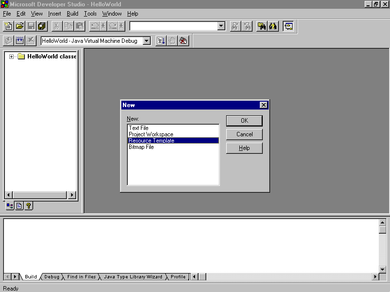
To create a resource template for use with your Visual J++ application, select File | New from the menubar. In the dialog box that appears, select Resource Template and click OK. (See Figure 12.1.)
Figure 12.1. Visual J++ New dialog box.
After you have created a Resource Template, you can add resources to it. To do so, select Insert | Resource from the Microsoft Developer Studio menu. For now, select Dialog from the Insert Resource window. (See Figure 12.2.)
Figure 12.2. The Insert Resource window.
Using the item on the Controls toolbar, experiment with drawing controls, sizing them, grouping them, and changing their properties. When you have a good idea how to manipulate a dialog and its controls, continue with the next section to learn about
what you can really do with a resource and how it relates to the Abstract Window Toolkit.
Java's Abstract Window Toolkit, or AWT, was designed to provide the standard graphical user interface (GUI) elements such as buttons, lists, menus, and text areas. You've actually been using the AWT all along, as you might have guessed from the classes
you've been importing. The applet class and most of the classes you've been using this week are all integral parts of the AWT.
The AWT provides the following:
Today you'll learn how to use all these components in your Java applets. Tomorrow you'll learn how to create windows, menus, and pop-up dialogs, which enable you to pop up separate windows from the browser window. Also, you can use the AWT in
stand-alone applications, so everything you've learned about applets so far this week can still be used with applications. Therefore, if you find the framework of the Web browser too limiting, you can take your AWT background and start writing full-fledged
Java applications.
Today, however, you'll continue focusing on applets.
Today's lesson is the most complex so far. There's a lot to cover and a lot of code to go through, so if it becomes overwhelming, you might want to take a little more time for this one.
The basic idea behind the AWT is that a Java window is a set of nested components, starting from the outermost window and progressing down to the smallest UI component. Components can include things you can actually see on the screen, such as windows,
menubars, buttons, and text fields, and they can also include containers that in turn can contain other components. Figure 12.3 shows how a sample page in a Java browser might include several different components, all of which are managed through the AWT.
Figure 12.3. A sample page in a Java browser.
This nesting of components within containers within other components creates a hierarchy of components, from the smallest checkbox inside an applet to the overall window on the screen. The hierarchy of components determines the arrangement of items on
the screen and inside other items, the order in which they are painted, and how events are passed from one component to another.
The following are the major components you can work with in the AWT:
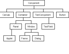
The classes inside the java.awt package are written and organized to mirror the abstract structure of containers, components, and individual UI components. Figure 12.4 shows some of the class hierarchy that makes up the main classes in the AWT.
Figure 12.4. Examples of class hierarchy.
The root of most of the AWT components is the class Component, which provides basic display and event handling features. The classes Container, Canvas, TextComponent, and many of the other UI components inherit from Component. Inheriting from the
Container class are objects that can contain other AWT components—the Panel and Window classes, in particular. Note that the java.applet.Applet class, even though it lives in its own package, inherits from Panel, so your applets are an integral part
of the hierarchy of components in the AWT system.
A GUI-based application that you write by using the AWT can be as complex as you like, with dozens of nested containers and components inside each other. AWT was designed so that each component can play its part in the overall AWT system without
needing to duplicate or keep track of the behavior of any other parts in the system.
The simplest form of an AWT component is the basic UI component. You can create and add these to your applet without needing to know anything about creating containers or panels—your applet, even before you start painting and drawing and handling
events, is already an AWT container. Because an applet is a container, you can put other AWT components—such as UI components or other containers—into it.
When creating a Java applet using Visual J++, it's easy to create the basic AWT components: you simply create a dialog box in the resource editor and then attach it to the applets frame.
Start by creating a new applet to work with. Create a new Project Workspace using the Java Applet Wizard. Name your Project UITest. Make sure that you select Yes to create a multithreaded applet and select No for animation support.
To create a new Resource Template, do the following:
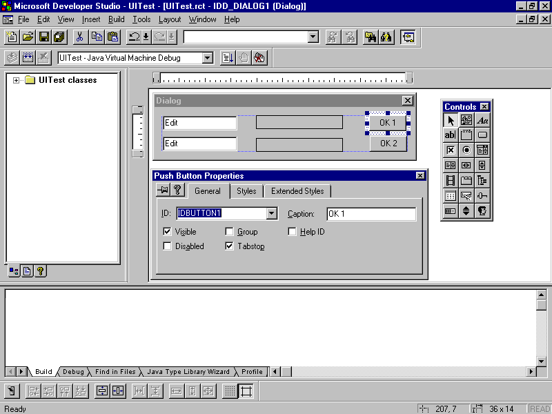
To access the properties of the controls you have just added, double-click on the controls or use the right mouse to pop up the menu and select properties.
When completed, your dialog box should look similar to the one in Figure 12.5. Granted, we knew what we were creating ahead of time, so your dialog box might not look at all like the one in the figure. Please, resize, realign, or relocate the objects
as necessary so your dialog box resembles Figure 12.5. When you're finished, save the Resource Template as UITest.rct.
Figure 12.5. Completed dialog box.
You might be wondering how in the world you are going to use these resources within your Visual J++ applet. The answer is simple: You aren't! (Well, at least directly you won't.) Instead, Visual J++ converts the work you just did in the Resource Editor
into native Java classes, which you then use in your project.
To convert the resource you just completed to Java code, start the Java Resource Wizard by selecting it from the Tools menu. See Figure 12.6.
Figure 12.6. Java Resource Wizard.
Use the Browse button to select the file UITest.rct and click Finish. Another dialog box appears letting you know what Java classes were created for you.
The files that the Java Resource Wizard creates should not be manually edited. If you need to make a change to a Java Resource Wizard generated file, you should go back to the Resource Editor, make the change, and then rerun the Java Resource Wizard.
We can't stress this point enough. Not only would you have to update the resource files, but also any dependencies in the .class files. Then if, at any time in the future, you used the Resource Editor to change anything else, your manual edits would more
than likely be overwritten by the Resource Wizard.
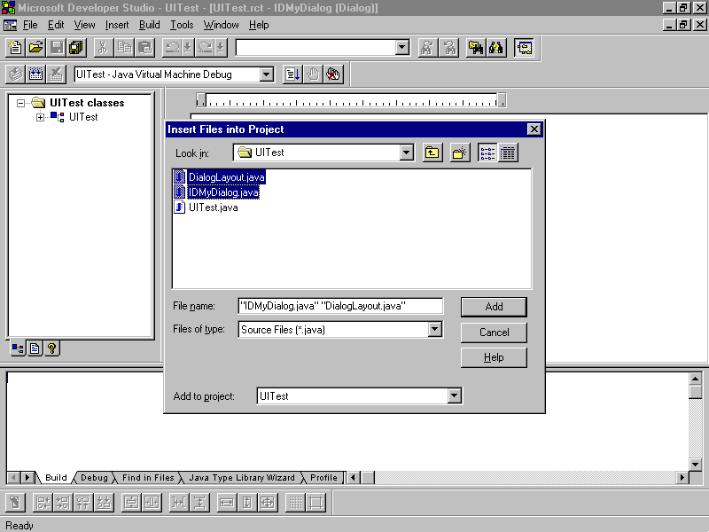
Now that you have created native Java classes, the first step is to include the .java files in your project. Select Insert | Insert Files into Project from the menu and select DialogLayout.java and IDMyDialog.java from the list of available files. (See
Figure 12.7.)
Figure 12.7. Insert Files into Project window.
At the top of the UITest class before the public class line, add the following import statement:
import IDMyDialog;
To create a member variable of type IDMyDialog, add the following line inside the class definition of UITest, just after the Thread declaration:
IDMyDialog m_dlg;
In the init() method of UITest, remove the resize(xx,xx) line, and add the following lines to create an instance of m_dlg and to draw the controls that we created:
m_dlg = new IDMyDialog( this );


m_dlg.CreateControls();
Finally, in the paint(Graphics g) method, comment out the drawString line.
// g.drawString("Running: " + Math.random(), 10, 20);
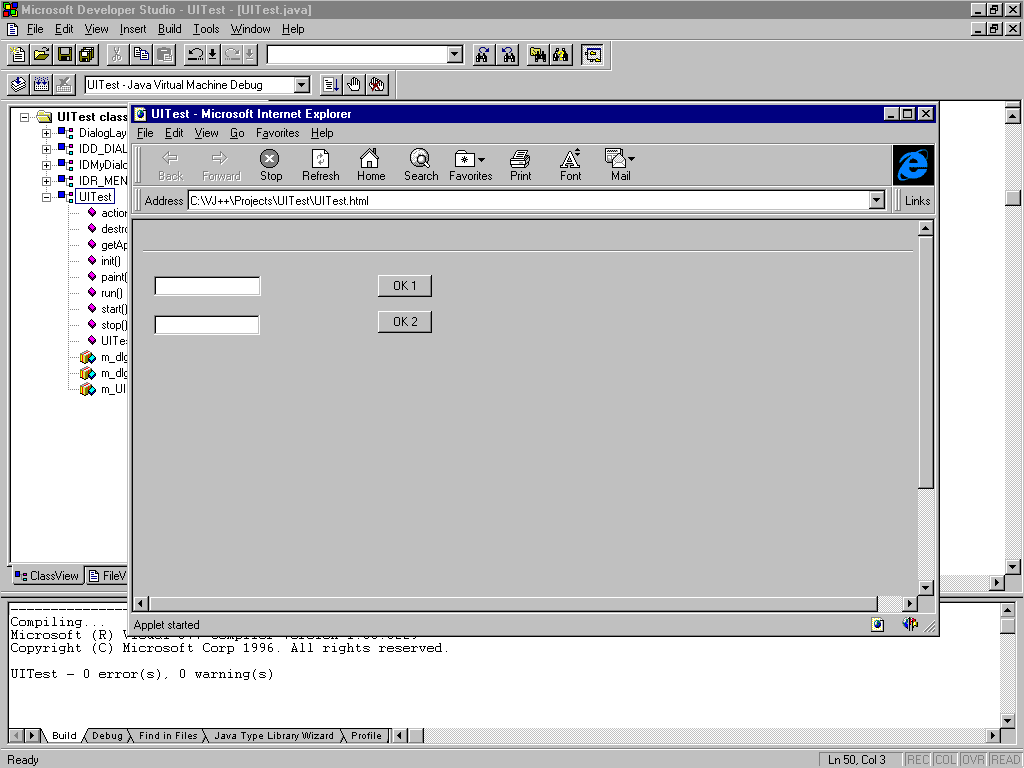
You are ready to test your applet, so compile and run it. Your display should look like the one in Figure 12.8.
Figure 12.8. The simple IDMyDialog applet.
Now that you have created a Dialog resource with some visual controls on it, it will be helpful to know what each control does, what its properties and methods are, and how to use them.
Note also that each of these components has an action associated with it—that is, something that the component does when it's activated. Actions generally trigger events or other activities in your applet (often called callbacks in other
window toolkits). In this section, you'll focus on creating the components themselves; later in today's lesson you'll learn about adding actions to them.
As you read through the rest of this section, you might be asking why we're not teaching you how to create the UI controls without using the Resource Editor and why we're explaining all the methods available for each type of control. The reasoning is
simple: the Resource Editor and Java Resource Wizard are quick and simple methods to design complex screens. Also, the Resource Editor and Java Resource Wizard simply create the control using the default properties that you set using the Resource Editor
control properties. All manipulation of the controls must be done via Java code and must be written by you. However, there are times when it isn't practical to use the Java Resource Wizard and you will want to create the controls yourself via code. This
section will provide you with the basics of UI controls, so you'll be able to create controls without the Resource Editor and Java Resource Wizard when need be.
The simplest form of UI component is the label.
Labels are text strings that you can use to label other UI components.
The advantages a label has over an ordinary text string are that it follows the layout of the given panel, and you don't have to worry about repainting it every time the panel is redrawn. Labels also can be easily aligned within a panel, enabling you
to attach labels to other UI components without knowing exact pixel positions.
To create a label via code without using the Resource Editor, use one of the following constructors:
The label's font is determined by the overall font for the component as set by the setFont() method.
Once you have a label object, you can use methods defined in the Label class to get and set the values of the text as shown in Table 12.1.
| Method | Action |
| getText() | Returns a string containing this label's text. |
| setText(String) | Changes the text of this label. |
| getAlignment() | Returns an integer representing the alignment of this label: 0 is Label.LEFT; 1 is Label.CENTER; 2 is Label.RIGHT. setAlignment(int) changes the alignment of this label to the given integer; use the class variables above. |
The second user interface component to explore is the button.
Buttons are simple UI components that trigger some action in your interface when they are pressed. For example, a calculator applet might have buttons for each number and operator, or a dialog box might have buttons for OK
and Cancel.
To create a button via code without using the Resource Editor, use one of the following constructors:
Once you have a button object, you can get the value of the button's label by using the getLabel() method, and you can set the label using the setLabel(String) method.
Along with labels and buttons, text fields are the most common type of user interface control. Where a label is generally used when displaying a description and a button is used for capturing a specific action from the user, a text field is used to
capture text data that the user enters.
To create a text field via code, without using the Resource Editor, use one of the following constructors:
Text fields include only the editable field itself. You usually need to include a label along with the text field to indicate what belongs in that text field.
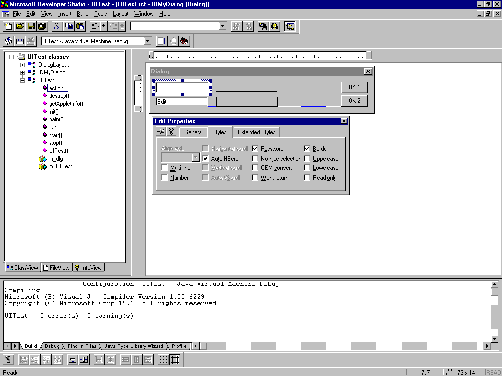
You can also create a text field that obscures the characters typed into it—for example, for password fields. To accomplish this using the Resource Editor, select the Styles tab in the properties page and check the Password box. (See Figure 12.9.)
Figure 12.9. Styles tab in Edit Properties window.
To accomplish this using code, create the text field (either by code or by the Resource Editor) and then use the setEchoCharacter() method to set the character that is echoed on the screen. An example follows:
TextField tf = new TextField(30);


tf.setEchoCharacter('*');
Text fields inherit from the class TextComponent and have a whole suite of methods, both inherited from that class and defined in its own class, that might be useful to you in your Java programs. Table 12.2 shows a selection of those methods.
| Method | Action |
| getText() | Returns the text this text field contains (as a string). |
| setText(String) | Puts the given text string into the field. |
| getColumns() | Returns the width of this text field |
| select(int, int) | Selects the text between the two integer positions. (Positions start from 0.) |
| selectAll() | Selects all the text in the field. |
| isEditable() | Returns true or false based on whether the text is editable or not. |
| setEditable(boolean) | true (the default) enables text to be edited; false freezes the text. |
| getEchoChar() | Returns the character used for masking input. |
| echoCharIsSet() | Returns true or false whether the field has a masking character or not. |
The remaining methods not shown in the table can be found using InfoView and searching on the topic TextComponent and TextField.
Checkboxes can be selected or deselected to indicate multiple options.
Checkboxes are user interface components that have two states: on and off (or checked and unchecked, selected and unselected, true and false, and so on). Unlike buttons, checkboxes usually don't trigger direct actions in a
UI, but instead, are used to indicate optional features of some other action.
You can create a checkbox via code, without using the Resource Editor, using one of the following constructors:
Table 12.3 lists the checkbox methods.
| Method | Action |
| getLabel() | Returns a string containing this checkbox's label |
| setLabel(String) | Changes the text of the checkbox's label |
| getState() | Returns true or false, based on whether the checkbox is selected or not |
| setState(boolean) | Changes the checkbox's state to selected (true) or unselected (false) |
Radio buttons are a variation of the checkbox.
Radio buttons have an appearance similar to checkboxes, but only one in the series can be selected at a time. Whereas checkboxes display a square box that is either checked or blank, radio buttons display a circle that is
either filled or blank. Also, unlike checkboxes, radio buttons provide for a mutually-exclusive option selection.
To create a series of radio buttons via code, without using the Resource Editor, first create an instance of CheckboxGroup:
CheckboxGroup cbg = new CheckboxGroup();
Then create and add the individual checkboxes, using the group as the second argument, and a true or false to determine whether that checkbox is selected. (Only one in the series can be selected.)
add(new Checkbox("Yes", cbg, true);


add(new Checkbox("no", cbg, false);
All the checkbox methods defined in the previous section can be used with the checkboxes in the group. Also, you can use the getCheckboxGroup() and setCheckboxGroup() methods to access and change the group of any given checkbox.
Finally, the getCurrent() and setCurrent(Checkbox) methods, defined in the checkbox group, can be used to get or set the currently selected checkbox.
The choice menu is a more complex UI component than a label, button, or checkbox.
Choice menus are pop-up (or pull-down) menus that allow the user to select an item from that menu. The menu then displays that choice on the screen.
To create a choice menu without using the Resource Editor, create an instance of the Choice and then use the addItem() method to add individual items to it in the order in which they should appear:
Choice c = new Choice();


c.addItem("Apples");


c.addItem("Oranges");


c.addItem("Strawberries");
Finally, add the entire choice menu to the panel in the usual way using the add method:
add;
Even if you use the Resource Editor to create the choice menu, you must programmatically add the individual items to the menu as follows:
m_dlg.IDC_COMBO1.addItem("Apples");


m_dlg.IDC_COMBO1.addItem("Oranges");


m_dlg.IDC_COMBO1.addItem("Strawberries");
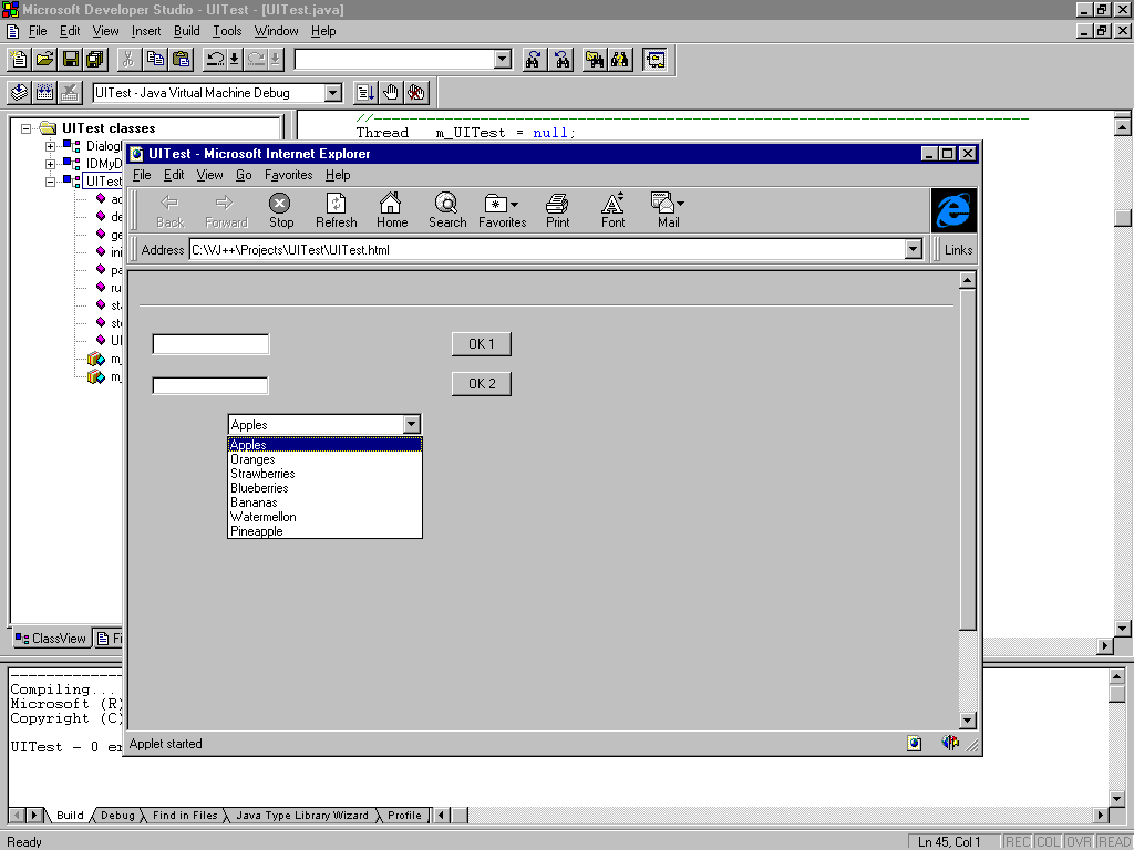
Figure 12.10 shows a simple choice menu generated from the code in the preceding example.
Figure 12.10. A simple choice menu.
After your choice menu is created, regardless of whether it's added to a panel or not, you can continue to add items to that menu by using the addItem() method. Table 12.4 shows some other methods that may be useful in working with choice menus.
| Method | Action |
| getItem(int) | Returns the string item at the given position. (Items inside a choice begin at 0, same as arrays.) |
| countItems() | Returns the number of items in the menu. |
| getSelectedIndex() | Returns the index position of the item that's selected. |
| getSelectedItem() | Returns the currently selected item as a string. |
| select(int) | Selects the item at the given position. |
| select(String) | Selects the item with the given string. |
An AWT panel can contain UI components or other panels. The question now is how those components are actually arranged and displayed on the screen.
In other windowing systems, UI components are often arranged using hard-coded pixel measurements—put text field tf at 10,30, for example—the same way you used the graphics operations to paint squares and ovals on the screen on Day 10. In the
AWT, the window may be displayed on many different windowing systems on many different screens and with many different kinds of fonts with different font metrics. Therefore, you need a more flexible method of arranging components on the screen so that a
layout that looks nice on one platform isn't a jumbled unusable mess on another.
For just this purpose, Java has layout managers, insets, and hints that each component can provide for helping lay out the screen.
Note that the nice thing about AWT components and user interface items is that you don't have to paint them: the AWT system manages all that for you. If you have graphic components or images, or you want to create an animation inside a panel, you still
have to do that by hand, but for most of the basic components, all you have to do is put them on the screen and Java will handle the rest.
When using the Resource Editor to design your user interfaces, which is the suggested manner, the Resource Editor creates a file called DialogLayout.java. This file manages all of the layout information for all of your dialogs. Thus, Visual J++ shields
you from one of the more complex aspects of Java programming.
The actual appearance of the AWT components on the screen is determined by two things: the order in which they are added to the panel that holds them and the layout manager that the panel is currently using to lay out the screen. The layout manager
determines how portions of the screen will be sectioned and how components within that panel will be placed.
Note that each panel on the screen can have its own layout manager. By nesting panels within panels and using the appropriate layout manager for each one, you can often arrange your UI to group and arrange components in a way that is both functionally
useful—and also looks good on a variety of platforms and windowing systems. You'll learn about nesting panels in a section later in this chapter.
The AWT provides five basic layout managers: FlowLayout, GridLayout, GridBagLayout, BorderLayout, and CardLayout. To create a layout manager for a given panel, use the setLayout() method for that panel:
public void init()


{


    setLayout(new FlowLayout());


}
Setting the default layout manager, like creating the user interface components, is best done during the applet's initialization, which is why we've done it that way.
After the layout manager is set, you can start adding components to the panel. The order in which components are added is often significant, and depends upon which layout manager is currently active. Read on for further information about the specific
layout managers and how they present components within the panel to which they apply.
The following sections describe the five basic Java AWT layout managers.
The FlowLayout class is the most basic of layouts. Using the flow layout, components are added to the panel one at a time, row by row. If a component doesn't fit onto a row, it's wrapped onto the next row. The flow layout also has an alignment
argument, which determines the alignment of each row. By default, each row is center-aligned.
To create a basic flow layout with a centered alignment, use the following line of code in your panel's initialization. (Because this is the default panel layout, you don't need to include this line, but you might want to because it makes code
maintenance easier.)
setLayout(new FlowLayout());
To create a flow layout with an alignment other than centered, add the FlowLayout.RIGHT or FlowLayout.LEFT class variable as an argument:
setLayout(new FlowLayout(FlowLayout.LEFT));
You can also set horizontal and vertical gap values by using flow layouts. The gap is the number of pixels between components in a panel; by default, the horizontal and vertical gap values are three pixels, which can be very close indeed. The
horizontal gap spreads out components to the left and to the right, and the vertical gap spreads out the top and bottom of each component.
setLayout(new FlowLayout(FlowLayout.LEFT), 10, 10);
Grid layouts use a layout that offers more control over the placement of components inside a panel. Using a grid layout, you portion off the area of the panel into rows and columns. Each component you then add to the panel is placed in a
"cell" of the grid, starting from the top row and progressing through each row from left to right. (Here's where the order of calls to the add() method are very significant to how the screen is laid out.) By using grid layouts and nested grids,
you can often approximate the use of hard-coded pixel values to place your UI components precisely where you want them.
To create a grid layout, indicate the number of rows and columns you want the grid to have when you create a new instance of the GridLayout class:
setLayout(new GridLayout(3, 3));
Grid layouts can also have a horizontal and vertical gap between components; to create gaps, add those pixel values:
setLayout(new GridLayout(3, 3, 10, 15));
Grid bag layouts, as implemented by the GridBagLayout class, are variations on grid layouts. Like grid layouts, grid bag layouts enable you to lay out your user interface elements in a rectangular grid, but with grid bag layouts you have much more
control over the presentation of each element in the grid. Grid bag layouts use a helper class, GridBagConstraints, to indicate how each cell in the grid is to be formatted.
Border layouts behave differently from flow and grid layouts. When you add a component to a panel that uses a border layout, you indicate its placement as a geographic direction: north, south, east, west, and center. The components around all the edges
are laid out with as much size as they need; the component in the center, if any, gets any space left over.
To use a border layout, you create it as you do the other layouts:
setLayout(new BorderLayout());
Then you add the individual components by using a special add() method: the first argument to add() is a string indicating the position of the component within the layout:
add("North", new TextField("Title", 50));


add("South", new TextField("Status", 50));
You can also use this form of add() for the other layout managers; the string argument will just be ignored if it's not needed.
Border layouts can also have horizontal and vertical gaps. Note that the north and south components extend to the edge of the panel, so the gap will result in less space for the east, right, and center components. To add gaps to a border layout,
include those pixel values as before:
setLayout(new BorderLayout(10, 10));
Card layouts are different from the other layouts. Unlike with the other three layouts, when you add components to a card layout, they are not all displayed on the screen at once. Card layouts are used to produce slide shows of components, one at a
time.
Generally when you create a card layout, the components you add to it will be other container components—usually panels. You can then use different layouts for those individual "cards" so that each screen has its own look.
When you add each "card" to the panel, you can give it a name. Then you can use methods defined on the CardLayout class to move back and forth between different cards in the layout.
For example, here's how to create a card layout containing three cards:
setLayout(new CardLayout());


Panel one = new Panel()


add("first", one);


Panel two = new Panel()


add("second", two);


Panel three = new Panel()


add("third", three);


show(this, "second");
Although you do not need to, it is very easy to use Layouts with Resource Editor and Java Resource Wizard created classes. Go back to the UITest applet and add the following new data member to the class:
IDMyDialog m_dlg2;
Replace all the code in the init() method with the following code:
setLayout(new GridLayout(1,2,10,10);


Panel pnl1 = new Panel();


Panel pn12 = new Panel();


add(p1);


add(p2);


m_dlg = new IDMyDialog( p1 );


m_dlg2 = new IDMyDialog( p2 );


m_dlg.CreateControls();


m_dlg2.CreateControls();
When you run this applet now, you should have two separate copies of the dialog box IDMyDialog created on the screen, as shown in Figure 12.11. Try using some of the other layout managers to see what the results are.
Figure 12.11. IDMyDialog applet version 2.
Whereas horizontal gap and vertical gap are used to determine the amount of space between components in a panel, insets are used to determine the amount of space around the panel itself. The Insets class provides values for the top, bottom, left, and
right insets, which are then used when the panel itself is drawn.
To include an inset, override the insets() method in the class (the Applet class or other class that serves as a panel):
public Insets insets()


{


   return new Insets(10, 10, 10, 10);


}
The arguments to the Insets constructor provide pixel insets for the top, bottom, left, and right edges of the panel. This particular example provides an inset of 10 pixels on all four sides of the panel.
Adding UI components to individual applets is fun, but applets begin to turn into lots of fun when you begin working with nested panels. By nesting different panels inside your applet, and panels inside those panels, you can create different layouts
for different parts of the overall applet area, isolate background and foreground colors and fonts to individual parts of an applet, and manage the design of your UI components much more cleanly and simply. The more complex the layout of your applet, the
more likely you're going to want to use nested panels.
Panels, as you've already learned, are components that can actually be displayed onscreen; Panel's superclass Container provides the generic behavior for holding other components inside it. The Applet class, from which all your applets inherit, is a
subclass of Panel. To nest other panels inside an applet, you merely create a new panel and add it to the applet, just as you would add any other UI component:
setLayout(new GridLayout(1, 2, 10, 10));


Panel panel1 = new Panel();


Panel panel2 = new Panel();


add(panel1);


add(panel2);
You can then set up an independent layout for those subpanels and add AWT components to them (including still more subpanels) by calling the add() method in the appropriate panel:
panel1.setLayout(new FlowLayout());


panel1.add(new Button("Up"));


panel1.add(new Button("Down"));
Although you can do all this in a single class, it's common in applets that make heavy use of the panels to factor out the layout and behavior of the subpanels into separate classes, and to communicate between the panels by using method calls. You'll
look at an extensive example of this later in today's lesson.
When you create applets with nested panels, those panels form a hierarchy from the outermost panel (the applet, usually), to the innermost UI component. This hierarchy is important to how each component in an applet interacts with the other components
in the applet or with the browser that contains that applet; in particular, the component hierarchy determines the order in which components are painted to the screen.
More importantly, the hierarchy also affects event handling, particularly for user input events such as mouse and keyboard events.
Events are received by the innermost component in the component hierarchy and passed up the chain to the root. Suppose, for example, that you have an applet with a subpanel that can handle mouse events (using the mouseDown() and mouseUp() methods) and
that subpanel contains a button. Clicking on the button means that the button receives the event before the panel does; if the button isn't interested in the mouseDown() method, the event gets passed to the panel, which can then process it or pass it
further up the hierarchy.
Remember the discussion about the basic event methods yesterday? You learned that the basic event methods all return boolean values. Those boolean values become important when you're talking about handling events or passing them on.
An event-handling method, whether it is the set of basic event methods or the more generic handleEvent(), can do one of three things, given any random event:
After you master the basic UI components and how to add them to panels and manage their events, you can add more UI components. In this section, you'll learn about text areas, scrolling lists, scrollbars, and canvases.
Text areas are like text fields, except they have more functionality for handling large amounts of text. Because text fields are limited in size and don't scroll, they are better for one-line responses and text entry; text areas can be any given width
and height and have scrollbars by default, so you can deal with larger amounts of text more easily.
When creating a text area using the Resource Editor, you use the text box control. To make a text box a text area, you simply modify the property page for the control and select the multiline checkbox. Even though the Resource Editor treats the
controls the same, the Java Resource Wizard treats them differently depending on whether they are multiline or not multiline.
To create a text area, without using the Resource Wizard, use one of the following constructors:
Both text areas and text fields inherit from the TextComponent class, so a lot of the behavior for text fields (particularly getting and setting text and selections) is usable on text areas as well. (See Table 12.5.) Text areas also have a number of
their own methods that you might find useful.
| Method | Action |
| getColumns() | Returns the width of the text area, in characters or columns. |
| getRows() | Returns the number of rows in the text area (not the number of rows of text that the text area contains). |
| insertText(String, int) | Inserts the string at the given position in the text (text positions start at 0). |
| replaceText(String, int, int) | Replace the text between the given integer positions with the new string. |
| setLineIncrement(int inc) | Change the increment for how far to scroll when the end-points of the scrollbar are selected. The default is 1. |
| getLineIncrement() | Returns the increment for how far to scroll when the end-points of the scrollbar are selected. |
| setPageIncrement(int inc) | Change the increment for how far to scroll when the inside range of the scrollbar is selected. The default is 10. |
| getPageIncrement() | Returns the increment for how far to scroll when the inside range of the scrollbar is selected. |
Remember the choice menu, which enables you to choose one of several different options? A scrolling list is functionally similar to a choice menu in that it enables you to pick several options from a list. Scrolling lists differ in two significant
ways:
When you use the Resource Editor, a scrolling list is identified by the term List Box. To change the type of selection that the list box accepts, change the Selection value under the Styles tab of the List Box Properties page.
To create a scrolling list without using the Resource Editor, create an instance of the List class and then add individual items to that list. The List class has two constructors:
After creating a List object, add items to it using the addItem() method as shown below:
List lst = new List(5, true);


lst.addItem("Hamlet");


lst.addItem("Ophelia");


add(lst);
Table 12.6 shows some of the methods available to scrolling lists. See the API documentation for a complete set.
| Method | Action |
| getItem(int) | Returns the string item at the given position |
| countItems() | Returns the number of items in the menu |
| getSelectedIndex() | Returns the index position of the item that's selected (used for lists that enable only single selections) |
| getSelectedIndexes() | Returns an array of index positions (used for lists that enable multiple selections) |
| getSelectedItem() | Returns the currently selected item as a string |
| getSelectedItems() | Returns an array of strings containing all the selected items |
| select(int) | Selects the item at the given position |
| select(String) | Selects the item with that string |
Text areas and scrolling lists come with their own scrollbars, which are built into those UI components and enable you to manage both the body of the area or the list and its scrollbar as a single unit. You can also create individual scrollbars, or
sliders, to manipulate a range of values.
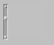
Scrollbars are used to select a value between a maximum and a minimum value. To change the current value of that scrollbar, you can use three different parts of the scrollbar. (See Figure 12.12.)
Figure 12.12. Scrollbar parts.
Choosing any of these visual elements causes a change in the scrollbar's value; you don't have to update anything or handle any events. All you have to do is give the scrollbar a maximum and minimum value, and Java will handle the rest.
Using the Resource Editor, it is very easy to create either a vertical or horizontal scrollbar. Simply draw a control of type Vertical Scroll Bar or Horizontal Scroll Bar. There is one limitation, however: The minimum value of the scrollbar will always
be 0, and the maximum will always be 99.
To create a scrollbar without using the Resource Editor, you can use one of three constructors:
The Scrollbar class provides several methods for managing the values within scrollbars. (See Table 12.7.)
| Method | Action |
| getMaximum() | Returns the maximum value. |
| getMinimum() | Returns the minimum value. |
| getOrientation() | Returns the orientation of this scrollbar: 0 is Scrollbar.HORIZONTAL; 1 is Scrollbar.VERTICAL. |
| getValue() | Returns the scrollbar's current value. |
| setValue(int) | Sets the current value of the scrollbar. |
Although you can draw on most AWT components, such as panels, canvases do little except let you draw on them. They can't contain other components, but they can accept events, and you can create an animation and display images on them. Canvases,
in other words, could have been used for much of the stuff you learned about earlier this week, but not for most of the stuff you learned today.
A canvas is a component that you can draw on.
To create a canvas, use the Canvas class and add it to a panel as you would any other component:
Canvas can = new Canvas();


add(can);
The Java AWT, or Abstract Window Toolkit, is a package of Java classes and interfaces for creating full-fledged access to a window-based graphical user interface system, with mechanisms for graphics display, event management, text and graphics
primitives, user interface components, and cross-platform layout. Applets are also an integral part of the AWT toolkit.
The Resource Editor and Java Resource Wizard are tools provided with Visual J++ to make dealing with the AWT even easier. For the most part, using a dialog box (or almost any other component) created in the Resource Wizard is much simpler than creating
all of the controls, the panels, the sizing, and the placement by writing the Java code yourself.
Today has been a big day; the lesson has brought together everything you've learned up to this point about simple applet management and added a lot more about creating applets, panels, and user interface components. The one major thing left to learn is
how to make your application do something. Right now, you can create some very nice-looking screens, but they don't do much. Tomorrow, we will change that.
Q: You've mentioned a lot about the Component and Container classes, but it looks like the only Container objects that ever get created are Panels. What do the Component and Container classes give me?
A: Those classes factor out the behavior for components (generic AWT components) and containers (components that can contain other components). Although you don't necessarily create direct instances of these classes, you can create subclasses of
them if you want to add behavior to the AWT that the default classes do not provide. As with most of the Java classes, whenever you need a superclass' behavior, don't hesitate to extend that class by using your own subclass.
Q: Can I put a UI component at a specific x and y position on the screen?
A: By using the existing layout managers supplied with the AWT toolkit, no. This is actually a good thing because you don't know what kind of display environment your applet will be run under, what kind of fonts are installed, or what kind of
fonts are being currently used. By using the layout managers provided with the AWT, you can be reasonably sure that every portion of your window will be viewable, readable, and usable (fonts may cause you trouble). You can't guarantee anything like that
with hard-coded layouts.
Q: I was exploring the AWT package, and I saw this subpackage called peer. There's also references to the peer classes sprinkled throughout the API documentation. What do peers do?
A: Peers are responsible for the platform-specific parts of the AWT. For example, when you create a Java AWT window, you have an instance of the Window class that provides generic window behavior, and then you have an instance of a class
implementing WindowPeer that creates the specific window for that platform—a motif window under X Window, a Macintosh-style window under the Macintosh, or a Windows 95 window under Windows 95. These "peers" classes also handle communication
between the window system and the Java window itself. By separating the generic component behavior (the AWT classes) from the actual system implementation and appearance (the peer classes), you can focus on providing behavior in your Java application and
let the Java implementation deal with the platform-specific details.
Q: There's a whole lot of functionality in the AWT that you haven't talked about here. Why?
A: Given that even a basic introduction took this long, we figured that if we put in even more detail than we already have, this chapter and the next could easily be a book unto themselves. In that regard, our mission is to give you the basics,
plus some of the extra stuff. We hope, because the AWT is so feature- packed, that if we point you in the right direction your inquisitive nature will fill in the missing details.
As it is, I've left windows, menus, and dialogs until tomorrow, so you'll have to wait for those. But you can find out about a lot of the other features of AWT merely by exploring the API documentation. Start with the Applet class and examine the sorts
of methods you can call. Then look at Panel, from which applet inherits—you have all that class's functionality as well. The superclass of Panel is Container, which provides still more interesting detail. Component comes next. Explore the API and see
what you can do with it. You might find something interesting.