by Mark Wutka
AWT components implement the basic interface widgets you expect to find in a windowing system. Containers and layout managers handle the difficult task of organizing the components into a reasonable structure. In order to display a component, you must place it in a container. An applet, for instance, is a container because it is a subclass of the Panel container.
A layout manager is like a set of instructions for placing a component within a container. Whenever you add a component to a container, the container consults its layout manager to find out where it should put the new component. While it may be difficult abandoning the old techniques of placing components by absolute coordinates, you need to adapt to this new model, because your applets may be running on screens with unusual layouts in the future. It is better to leave the placement to the container and layout manager.
You need more than just components to create a good user interface. The components need to be organized into manageable groups. That's where containers come in. Containers contain components. You cannot use a component in the AWT unless it is contained within a container. A component without a container is like a refrigerator magnet without a refrigerator. The containers defined in the AWT are:
Even if you don't create a container in your applet, you are still using one. The Applet class is a subclass of the Panel class.
TIP: Containers not only contain components; they are components themselves. This means that a container can contain other containers.
Even though a container is a place where your user interface (UI) components can be stored neatly, you still need a way to organize the components within a container. That's where the layout managers come in. Each container is given a layout manager that decides where each component should be displayed. The layout managers in the AWT are:
All containers perform the same basic function, which is that they contain other components. You place a component in a container by calling one of the add methods in the container:
public synchronized Component add(Component newComponent)
adds newComponent to the end of the container. A container is like an array or a vector in that each component contained in it has a specific position or index value.
public synchronized Component add(Component newComponent, int pos)
adds newComponent at position pos in the container. The components from position pos to the end are all shifted up in position. In other words, this method does not replace the component at pos; it inserts the new component right before it.
public synchronized Component add(String name, Component newComponent)
adds newComponent to the end of the container. The component is also added to the container's layout manager as a component named name. Some layout managers, like the BorderLayout, require each component to have a specific name in order to be visible. Other layout managers ignore the name if they do not require it.
The remove method removes a component from a container:
public synchronized void remove(Component comp)
The removeAll method removes all of the components from a container:
public synchronized void removeAll()
You can get the nth component in the container using the getComponent method, or you can get all of the components with getComponents:
public synchronized Component getComponent(int n)
throws ArrayIndexOutOfBoundsException
public synchronized Component[] getComponents()
The countComponents method returns the total number of components stored in this container:
public int countComponents()
Because panels are only used for organizing components, there are very few things you can actually do to a panel. You create a new panel with:
Panel myPanel = new Panel();
You can then add the panel to another container. For instance, you might want to add it to your applet:
add(myPanel);
You can also nest panels--one panel containing one or more panels:
Panel mainPanel, subPanel1, subPanel2;
subPanel1 = new Panel();   // create the first sub-panel
subPanel2 = new Panel();   // create the second sub-panel
mainPanel = new Panel();   // create the main panel
mainPanel.add(subPanel1);  // Make subPanel1 a child (sub-panel) of mainPanel
mainPanel.add(subPanel2);  // Make subPanel2 a child of mainPanel
You can nest panels as many levels deep as you like. For instance, in the previous example, you could have made subPanel2 a child of subPanel1 (obviously with different results).
Listing 30.1 shows how to create panels and nest sub-panels within them:
import java.awt.*;
import java.applet.*;
// PanelApplet
//
// The PanelApplet applet creates a number of panels and
// adds buttons to them to demonstrate the use of panels
// for grouping components.

public class PanelApplet extends Applet
{
     public void init()
     {
// Create the main panels
          Panel mainPanel1 = new Panel();
          Panel mainPanel2 = new Panel();

// Create the sub-panels
          Panel subPanel1 = new Panel();
          Panel subPanel2 = new Panel();

// Add a button directly to the applet
          add(new Button("Applet Button"));

// Add the main panels to the applet
          add(mainPanel1);
          add(mainPanel2);

// Give mainPanel1 a button and a sub-panel
          mainPanel1.add(new Button("Main Panel 1 Button"));
          mainPanel1.add(subPanel1);

// Give mainPanel2 a button and a sub-panel
          mainPanel2.add(new Button("Main Panel 2 Button"));
          mainPanel2.add(subPanel2);

// Give each sub-panel a button
          subPanel1.add(new Button("Sub-panel 1 Button"));

          subPanel2.add(new Button("Sub-panel 2 Button"));
     }
}
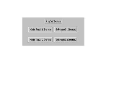
Figure 30.1 shows the output from PanelApplet.
FIG. 30.1
Panels, like other containers, help group components together.
Frames are powerful features of the AWT. They enable you to create separate windows for your application. For instance, you might want your application to run outside the main window of a Web browser. You can also use frames to build stand-alone graphical applications.
You can create a frame that is initially invisible and has no title with the empty constructor:
public Frame()
You can give the frame a title when you create it, but it will still be invisible:
public Frame(String frameTitle)
Once you have created a frame, you will probably want to see it. Before you can see the frame, you must give it a size. Use the resize method to set the size:
myFrame.resize(300, 100); // Make the frame 300 pixels wide, 100 high
You can use the show method to make it visible:
myFrame.show(); // Show yourself, Frame!
You can send a frame back into hiding with the hide method. Even though the frame is invisible, it still exists:
myFrame.hide();
As long as a frame exists, invisible or not, it is consuming some of the resources in the windowing system it is running on. If you are finished with a frame, you should get rid of it with the dispose method:
public synchronized void dispose()
You can change the title displayed at the top of the frame with setTitle:
public void setTitle(String newTitle)
For example:
myFrame.setTitle("With Frames like this, who needs enemies?");
The getTitle method will return the frame's title:
public String getTitle()
The Frame class has a number of different cursors. You can change the frame's cursor with setCursor:
public void setCursor(int cursorType)
The available cursors are:
Frame.DEFAULT_CURSOR
Frame.CROSSHAIR_CURSOR
Frame.TEXT_CURSOR
Frame.WAIT_CURSOR
Frame.HAND_CURSOR F
rame.MOVE_CURSOR
Frame.N_RESIZE_CURSOR
Frame.NE_RESIZE_CURSOR
Frame.E_RESIZE_CURSOR
Frame.SE_RESIZE_CURSOR
Frame.S_RESIZE_CURSOR
Frame.SW_RESIZE_CURSOR
Frame.W_RESIZE_CURSOR
Frame.NW_RESIZE_CURSOR
The getCursorType method will return one of these values indicating the current cursor type:
public int getCursorType()
If you do not want to allow your frame to be resized, you can call setResizable to turn resizing on or off:
public void setResizable(boolean allowResizing)
The isResizable method will return true if a frame can be resized:
public boolean isResizable()
You can change a frame's icon with setIconImage:
public setIconImage(Image image)
You can create applets that can run either as an applet or as a standalone application. All you need to do is write a main method in the applet that creates a frame and then an instance of the applet that belongs to the frame. Listing 30.2 shows an applet that can run either as an applet or as a standalone application.
import java.awt.*;
import java.applet.*;

// StandaloneApplet is an applet that runs either as
// an applet or a standalone application.  To run
// standalone, it provides a main method that creates
// a frame, then creates an instance of the applet and
// adds it to the frame.

public class StandaloneApplet extends Applet
{
     public void init()
     {
          add(new Button("Standalone Applet Button"));
     }

     public static void main(String args[])
     {
// Create the frame this applet will run in
          Frame appletFrame = new Frame("Some applet");

// Create an instance of the applet
          Applet myApplet = new StandaloneApplet();

// Initialize and start the applet
          myApplet.init();
          myApplet.start();

// The frame needs a layout manager
          appletFrame.setLayout(new FlowLayout());

// Add the applet to the frame
          appletFrame.add(myApplet);

// Have to give the frame a size before it is visible
          appletFrame.resize(300, 100);

// Make the frame appear on the screen
          appletFrame.show();
     }
}
You can attach a MenuBar class to a frame to provide drop-down menu capabilities. You can create a menu bar with:
MenuBar myMenuBar = new MenuBar();
Once you have created a menu bar, you can add it to a frame by using the setMenuBar method:
myFrame.setMenuBar(myMenuBar);
Once you have a menu bar, you can add menus to it by using the add method:
public synchronized Menu add(Menu newMenu)
The following code fragment creates a menu called "File" and adds it to the menu bar:
Menu fileMenu = new Menu("File");
myMenuBar.add(fileMenu);
Some windowing systems allow you to create menus that stay up after you release the mouse button. These are referred to as tear-off menus. You can specify that a menu is a tear-off menu when you create it:
public Menu(String menuLabel, boolean allowTearoff)
In addition to adding submenus, you will want to add menu items to your menus. Menu items are the parts of a menu that the user actually selects. Menus, on the other hand, are used to contain menu items as well as submenus. For instance, the File menu on many systems contains menu items such as New, Open, Save, and Save As. If you created a menu structure with no menu items, the menu structure would be useless. There would be nothing to select. You may add menu items to a menu in two ways. You can simply add an item name with:
fileMenu.add("Open"); // Add an "Open" option to the file menu
You can also add an instance of a MenuItem class to a menu:
MenuItem saveMenuItem = new MenuItem("Save");
         // Create a "Save" menu item

fileMenu.add(saveMenuItem);        // Add the "Save" option to the file menu
You can enable and disable menu items by using enable and disable. When you disable a menu item, it still appears on the menu, but it usually appears in gray (depending on the windowing system). You cannot select menu items that are disabled. The format for enable and disable is:
saveMenuItem.disable();     // Disables the save option from the file menu
saveMenuItem.enable();      // Enables the save option again
In addition to menu items, you can add submenus and menu separators to a menu. A separator is a line that appears on the menu to separate sections of the menu. To add a separator, just call the addSeparator method:
public void addSeparator()
To create a submenu, just create a new instance of a menu and add it to the current menu:
Menu printSubmenu = new Menu("Print");
fileMenu.add(printSubmenu);
printSubmenu.add("Print Preview");
         // Add print preview as option on Print menu
printSubmenu.add("Print Document");

         // Add print document as option on Print menu
You can also create special checkbox menu items. These items function like the checkbox buttons. The first time you select one, it becomes checked or "on." The next time you select it, it becomes unchecked or "off." To create a checkbox menu item:
public CheckboxMenuItem(String itemLabel)
The getState method returns true if a checkbox menu item is checked:
public boolean getState()
You can set the current state of a checkbox menu item with setState:
public void setState(boolean newState)
Normally, menus are added to a menu bar in a left-to-right fashion. Many windowing systems, however, create a special "help" menu that is on the far right of a menu bar. You can add such a menu to your menu bar with the setHelpMenu method:
public synchronized void setHelpMenu(Menu helpMenu)
Whenever a menu item is selected, it generates either an action event, or it calls its action method depending on the event model you are using (Java 1.1 vs. Java 1.0). Under Java 1.0, the whichAction parameter to the action method will be the name of the item selected:
public boolean action(Event evt, Object whichAction)
{

// First, make sure this event is a menu selection

     if (evt.target instanceof MenuItem)
     {
          if ((String)whichAction == "Save")
          {
               // Handle save option
          }
     }
     return true;
}
Under the Java 1.1 event model, you must set up an ActionListener for the menu, which implements the actionPerformed method to receive notification that an action has occurred:
public void actionPerformed(ActionEvent event)
{
	if (event.getSource() instanceOf MenuComponent)
	{
		if (event.getSource() == saveMenuComponent)
		{
			// Handle save option
		}
	}

}
Listing 30.3 shows an application that sets up a simple File menu with New, Open, and Save menu items; a checkbox called Auto-Save; and a Print submenu with two menu items on it.
import java.awt.*;
import java.applet.*;

public class MenuApplication extends Object
{
     public static void main(String[] args)
     {
// Create the frame and the menubar
          Frame myFrame = new Frame("Menu Example");
          MenuBar myMenuBar = new MenuBar();

// Add the menubar to the frame
          myFrame.setMenuBar(myMenuBar);

// Create the File menu and add it to the menubar
          Menu fileMenu = new Menu("File");
          myMenuBar.add(fileMenu);

// Add the New and Open menuitems
          fileMenu.add(new MenuItem("New"));
          fileMenu.add(new MenuItem("Open"));

// Create a disabled Save menuitem
          MenuItem saveMenuItem = new MenuItem("Save");
          fileMenu.add(saveMenuItem);
          saveMenuItem.disable();

// Add an Auto-Save checkbox, followed by a separator
          fileMenu.add(new CheckboxMenuItem("Auto-Save"));
          fileMenu.addSeparator();

// Create the Print submenu
          Menu printSubmenu = new Menu("Print");
          fileMenu.add(printSubmenu);
          printSubmenu.add("Print Preview");
          printSubmenu.add("Print Document");

// Must resize the frame before it can be shown
          myFrame.resize(300, 200);

// Make the frame appear on the screen
          myFrame.show();
     }
}
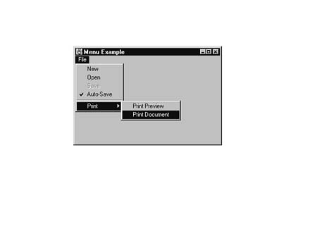
Figure 30.2 shows the output from the MenuApplication program with the
Print Document option in the process of being selected.
FIG. 30.2
The AWT provides a number of popular menu features including checked menu items,
disabled menu items, and separators.
It is frequently desirable to create a pop-up menu for a component, where you click the component with the right or middle mouse button and bring up a menu specific to that component. Under Java 1.1, you can create such a menu.
You create a pop-up menu the same way you create a regular menu. You first instantiate a pop-up menu using either of these constructors:
public PopupMenu()
public PopupMenu(String title)
Next, you add MenuItem objects to the pop-up menu, just like a regular menu. Once you have added all the items you want, you add the pop-up menu to a component using the component's add method like this:
PopupMenu popup = new PopupMenu("Button Stuff");
popup.add("Winken");
popup.add("Blinken");
popup.add("Nodd");
Button myButton = new Button("Push Me");

myButton.add(popup);
Dialogs are pop-up windows that are not quite as flexible as frames. You can create a dialog as either modal or non-modal. The term modal means that the dialog box blocks input to other windows while it is being shown. This is useful for dialogs where you want to stop everything and get a crucial question answered, such as, "Are you sure you want to quit?" An example of a "non-modal" dialog box might be a control panel that changes settings in an application while the application continues to run.
You must first have a frame in order to create a dialog. A dialog cannot belong to an applet. However, an applet may create a frame to which the dialog can then belong. You must specify whether a dialog is modal or non-modal at creation time and cannot change its "modality" once it has been created:
public Dialog(Frame parentFrame, boolean isModal)
The following example creates a dialog whose parent is myFrame and is modal:
Dialog myDialog = new Dialog(myFrame, true); // true means model dialog
You can also create a dialog with a title:
public Dialog(Frame parentFrame, String title, boolean isModal)
NOTE: Because dialogs cannot belong to applets, your use of dialogs can be somewhat limited. One solution is to create a dummy frame as the dialog's parent. Unfortunately, you cannot create modal dialogs this way, because only the frame and its children would have their input blocked--the applet would continue on its merry way. A better solution is to use the technique discussed in the "Frames" section of this chapter. In this case, you create a stand-alone application using frames, have a small startup applet create a frame, and then run the real applet in that frame.
Once you have created a dialog, you can make it visible using the show method:
myDialog.show();
The Dialog class has several methods in common with the Frame class:
     void setResizable(boolean);
     boolean isResizable();
     void setTitle(String);

     String getTitle();
In addition, the isModal method will return true if the dialog is modal:
public boolean isModal()
Listing 30.4 shows the OKDialog class, which provides an OK dialog box that displays a message and waits for you to click OK. You normally must supply a frame for the dialog box, but you don't create a frame when running an applet. To allow applets to use the dialog box, this class provides a static createOKDialog method that first creates a frame for the dialog box. The frame is saved as a static variable, so other dialog boxes can use the same frame.
import java.awt.*;
//
// OKDialog - Custom dialog that presents a message and waits for
// you to click on the OK button.
//
// Example use:
//     Dialog ok = new OKDialog(parentFrame, "Click OK to continue");
//     ok.show();     // Other input will be blocked until OK is pressed
// As a shortcut, you can use the static createOKDialog that will
// create its own frame and activate itself:
//     OKDialog.createOKDialog("Click OK to continue");
//

public class OKDialog extends Dialog
{
     protected Button okButton;
     protected static Frame createdFrame;

     public OKDialog(Frame parent, String message)
     {
          super(parent, true);     // Must call the parent's constructor

// This Dialog box uses the GridBagLayout to provide a pretty good layout.

          GridBagLayout gridbag = new GridBagLayout();
          GridBagConstraints constraints = new GridBagConstraints();

// Create the OK button and the message to display
          okButton = new Button("OK");
          Label messageLabel = new Label(message);

          setLayout(gridbag);

// The message should not fill, it should be centered within this area, with
// some extra padding.  The gridwidth of REMAINDER means this is the only
// thing on its row, and the gridheight of RELATIVE means there should only
// be one thing below it.
          constraints.fill = GridBagConstraints.NONE;
          constraints.anchor = GridBagConstraints.CENTER;
          constraints.ipadx = 20;
          constraints.ipady = 20;
          constraints.weightx = 1.0;
          constraints.weighty = 1.0;
          constraints.gridwidth = GridBagConstraints.REMAINDER;
          constraints.gridheight = GridBagConstraints.RELATIVE;

          gridbag.setConstraints(messageLabel, constraints);
          add(messageLabel);

// The button has no padding, no weight, takes up minimal width, and
// Is the last thing in its column.

          constraints.ipadx = 0;
          constraints.ipady = 0;
          constraints.weightx = 0.0;
          constraints.weighty = 0.0;
          constraints.gridwidth = 1;
          constraints.gridheight = GridBagConstraints.REMAINDER;

          gridbag.setConstraints(okButton, constraints);
          add(okButton);

// Pack is a special window method that makes the window take up the minimum
// space necessary to contain its components.

          pack();

     }

// The action method just waits for the OK button to be clicked and
// when it is it hides the dialog, causing the show() method to return
// back to whoever activated this dialog.

     public boolean action(Event evt, Object whichAction)
     {
          if (evt.target == okButton)
          {
               hide();
               if (createdFrame != null)
               {
                    createdFrame.hide();
               }
          }
          return true;
     }

// Shortcut to create a frame automatically, the frame is a static variable
// so all dialogs in an applet or application can use the same frame.

     public static void createOKDialog(String dialogString)
     {
// If the frame hasn't been created yet, create it
          if (createdFrame == null)
          {
               createdFrame = new Frame("Dialog");
          }
// Create the dialog now
          OKDialog okDialog = new OKDialog(createdFrame, dialogString);

// Shrink the frame to just fit the dialog
          createdFrame.resize(okDialog.size().width,
               okDialog.size().height);

// Show the dialog
          okDialog.show();

     }
}
The DialogApplet in Listing 30.5 pops up an OK dialog whenever a button is pressed.
import java.awt.*;
import java.applet.*;

// DialogApplet
//
// Dialog applet creates a button, and when you press
// the button it brings up an OK dialog.  The input
// to the original button should be blocked until
// the OK button in the dialog is pressed.

public class DialogApplet extends Applet
{
     protected Button launchButton;

     public void init()
     {
          launchButton = new Button("Give me an OK");
          add(launchButton);
     }

     public boolean action(Event event, Object whichAction)
     {
// Make sure this action is for the launchButton
          if (event.target != launchButton)
          {
               return false;
          }

// Create and display the OK dialog
          OKDialog.createOKDialog(
               "Press OK when you are ready");

// Signal that you've handled the event
return true;
     }
}
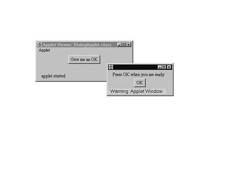
Figure 30.3 shows the DialogApplet with the OK dialog popped up.
FIG. 30.3
The OKDialog class creates a pop-up dialog box with an OK button.
A ScrollPane is a special container that contains scrollbars to allow you to scroll the contents of the container. This allows you to create very large containers that don't have to be displayed all at once. A common use for a ScrollPane is to display a large image. You can create a canvas that displays the image and then place it in a ScrollPane container to provide automatic scrolling of the image.
You can control the scroll pane's use of scrollbars. By default, a scroll pane uses scrollbars only if needed. You can specify that it should always use scrollbars, or never use scrollbars (in which case it is no different from a Panel object). If you use the default constructor, the scroll pane uses scrollbars if needed, otherwise you can pass either ScrollPane.SCROLLBARS_ALWAYS, ScrollPane.SCROLLBARS_NEVER, or ScrollPane.SCROLLBARS_AS_NEEDED to the constructor:
public ScrollPane()
public ScrollPane(int scrollbarOption)
You add components to a scroll pane the same way you do with any other container. You can set the position of the viewing area by calling setScrollPosition with either a Point object or x and y coordinates:
public void setScrollPosition(Point point)
public void setScrollPosition(int x, int y)
The setScrollPosition method only controls the upper-left corner of the viewing area. The rest is determined by the size of the scroll pane.
If you want to listen for events from the scroll pane's scrollbars, you can call getHAdjustable and getVAdjustable to get Adjustable interfaces for the horizontal and vertical scrollbars:
public Adjustable getHAdjustable()
public Adjustable getVAdjustable()
The Adjustable interface, in turn, allows you to listen for events with setAdjustableListener.
You can also determine the width and height of the viewing area with getViewport:
public Dimension getViewport()
If you haven't noticed already, when you add components to a container you don't have to tell the container where to put a component. By using layout managers, you tell the AWT where you want your components to go relative to the other components. The layout manager figures out exactly where to put them. This helps you make platform-independent software. When you position components by absolute coordinates, it can cause a mess when someone running Windows 95 in 640x480 resolution tries to run an applet that is designed to fit on a 1280x1024 X-terminal.
The AWT provides five different types of layout managers:
A FlowLayout class treats a container as a set of rows. The heights of the rows are determined by the height of the items placed in the rows. The FlowLayout starts adding new components from left to right. If it cannot fit the next component onto the current row, it drops down to the next row and starts again from the left. It also tries to align the rows using either left- justification, right-justification, or centering. The default alignment for a FlowLayout is centered, which means that when it creates a row of components, it will try to keep it centered with respect to the left and right edges.
TIP: The FlowLayout layout manager is the default layout manager for all applets.
The empty constructor for the FlowLayout class creates a flow layout with a centered alignment:
public FlowLayout()
You may also specify the alignment when you create the flow layout:
public FlowLayout(int alignment)
The different types of FlowLayout alignment are FlowLayout.LEFT, FlowLayout.RIGHT, and FlowLayout.CENTER.
You may also give the FlowLayout horizontal and vertical gap values. These values specify the minimum amount of horizontal and vertical space to leave between components. These gaps are given in units of screen pixels:
public FlowLayout(int alignment, int hgap, int vgap)
To create a right-justified FlowLayout with a horizontal gap of ten pixels and a vertical gap of five pixels:
myFlowLayout = new FlowLayout(FlowLayout.RIGHT, 10, 5);
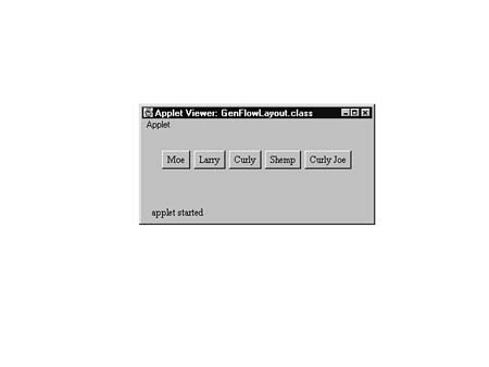
Figure 30.4 shows five buttons arranged in a flow layout.
FIG. 30.4
The flow layout places components from left to right.
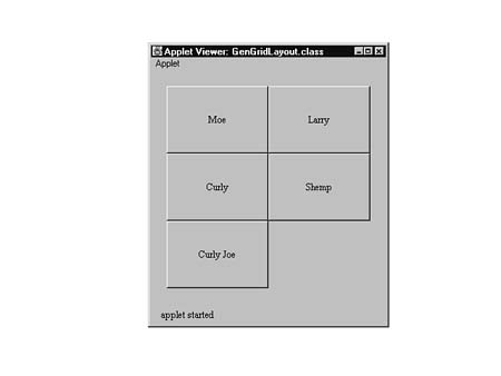
A GridLayout class divides a container into a grid of equally sized cells. When you add components to the container, the GridLayout places them from left to right starting in the top left cells. When you create a GridLayout class, you must tell it how many rows or columns you want. If you give it a number of rows, it will compute the number of columns needed. If, instead, you give it a number of columns, it will compute the number of rows needed. If you add six components to a GridLayout with two rows, it will create three columns. The format of the GridLayout constructor is:
public GridLayout(int numberOfRows, int numberOfColumns)
If you create a GridLayout with a fixed number of rows, you should use 0 for the number of columns. If you have a fixed number of columns, use 0 for the number of rows.
NOTE: If you pass non-zero values to GridLayout for both the number of rows and the number of columns, it will only use the number of rows. The number of columns will be computed based on the number of components and the number of rows. GridLayout(3, 4) is exactly the same as GridLayout(3, 0).
You may also specify a horizontal and vertical gap:
public GridLayout(int rows, int cols, int hgap, int vgap)
The following code creates a GridLayout with four columns, a horizontal gap of eight, and a vertical gap of ten:
GridLayout myGridLayout = new GridLayout(0, 4, 8, 10);
Figure 30.5 shows five buttons arranged in a grid layout.
FIG. 30.5
The grid layout allocates equally sized areas for each component.
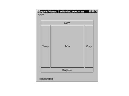
A BorderLayout class divides a container into five areas named "North," "South," "East," "West," and "Center." When you add components to the container, you must use a special form of the add method that includes one of these five area names. These five areas are arranged like the points on a compass. A component added to the "North" area is placed at the top of the container, while a component added to the "West" area is placed on the left side of the container.
The BorderLayout class does not allow more than one component in an area. You may optionally specify a horizontal and vertical gap. To create a BorderLayout without specifying a gap, use the empty constructor:
public BorderLayout()
You can also specify the horizontal and vertical gap with:
public BorderLayout(int hgap, int vgap)
To add myButton to the "West" area of the BorderLayout:
myBorderLayout.add("West", myButton);
CAUTION:
The BorderLayout class is very picky about how and where you add components. It requires you to use the add method that takes a string name along with the component. If you try to add a component using the regular add method (without the area name), you will not see your component. If you try to add two components to the same area, you will only see the last component added.
Listing 30.6 shows a BorderLayoutApplet that creates a BorderLayout, attaches it to the current applet, and adds some buttons to the applet.
import java.applet.*;
import java.awt.*;

//
// This applet creates a BorderLayout and attaches it
// to the applet.  Then it creates buttons and places
// in all possible areas of the layout.

public class BorderLayoutApplet extends Applet
{
     public void init()
     {

// First create the layout and attach it to the applet

          setLayout(new BorderLayout());

// Now create some buttons and lay them out

          add("North", new Button("Larry"));
          add("South", new Button("Curly Joe"));
          add("East", new Button("Curly"));
          add("West", new Button("Shemp"));
          add("Center", new Button("Moe"));
     }
}
Figure 30.6 shows five buttons arranged in a border layout.
FIG. 30.6
The border layout places components at the "North," "South,"
"East," and "West" compass points, as well as in the "Center."
The GridBagLayout class, like the GridLayout, divides a container into a grid of equally sized cells. Unlike the GridLayout, however, the GridBagLayout class decides how many rows and columns it will have and allows a component to occupy more than one cell, if necessary. The total area that a component occupies is called its display area. Before you add a component to a container, you must give the GridBagLayout a set of "suggestions" on where to put the component. These suggestions are in the form of a GridBagConstraints class. The GridBagConstraints class has a number of variables to control the placement of a component:
GridbagConstraints.NORTH
GridBagConstraints.NORTHEAST
GridBagConstraints.EAST
GridBagConstraints.SOUTHEAST
GridBagConstraints.SOUTH
GridBagConstraints.SOUTHWEST
GridBagConstraints.WEST
GridBagConstraints.NORTHWEST
When you want to add a component to a container using a GridBagLayout, you create the component, then create an instance of GridBagConstraints, and set the constraints for the component. For instance:
GridBagLayout myGridBagLayout = new GridBagLayout();
setLayout(myGridBagLayout);
         // Set the applet's Layout Manager to myGridBagLayout

Button myButton = new Button("My Button");
GridBagConstraints constraints = new GridBagConstraints();
constraints.weightx = 1.0;
constraints.gridwidth = GridBagConstraints.RELATIVE;

constraints.fill = GridBagConstraints.BOTH;
Next, you set the component's constraints in the GridBagLayout with:
myGridLayout.setConstraints(myButton, constraints);
Now you may add the component to the container:
add(myButton);
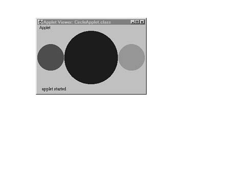
The applet in Listing 30.7 uses the GridBagLayout class to arrange a few instances of CircleCanvas (created in the section "Canvases" earlier in this chapter).
import java.applet.*;
import java.awt.*;

//
// This circle demonstrates the CircleCanvas class we
// created.  It also shows you how to use the GridBagLayout
// to arrange the circles.

public class CircleApplet extends Applet
{
     public void init()
     {
          GridBagLayout gridbag = new GridBagLayout();
          GridBagConstraints constraints = new GridBagConstraints();
          CircleCanvas newCircle;

          setLayout(gridbag);

// You'll use the weighting to determine relative circle sizes. Make the
// first one just have a weight of 1. Also, set fill for both directions
// so it will make the circles as big as possible.

          constraints.weightx = 1.0;
          constraints.weighty = 1.0;
          constraints.fill = GridBagConstraints.BOTH;

// Create a red circle and add it

          newCircle = new CircleCanvas(Color.red);
          gridbag.setConstraints(newCircle, constraints);
          add(newCircle);

// Now, you want to make the next circle twice as big as the previous
// one, so give it twice the weight.

          constraints.weightx = 2.0;
          constraints.weighty = 2.0;

// Create a blue circle and add it

          newCircle = new CircleCanvas(Color.blue);
          gridbag.setConstraints(newCircle, constraints);
          add(newCircle);

// You'll make the third circle the same size as the first one, so set the
// weight back down to 1.

          constraints.weightx = 1.0;
          constraints.weighty = 1.0;

// Create a green circle and add it.

          newCircle = new CircleCanvas(Color.green);
          gridbag.setConstraints(newCircle, constraints);
          add(newCircle);

     }
}
Figure 30.7 shows the three circle canvases from the GridBagApplet.
FIG. 30.7
The GridBagApplet creates three circle canvases.
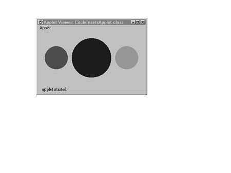
Insets are not layout managers. They are instructions to the layout manager about how much space to leave around the edges of the container. In other words, insets define an empty area between the edge of a container and the components it contains. If you have an inset of 20 pixels on the left side of a container, no component will be placed closer than 20 pixels to the left edge of the container.
Insets are described by an instance of the Insets class. This class has instance variables for the left, top, right, and bottom inset values. The layout manager determines the inset values for a container by calling the container's insets method, which returns an instance of an Insets class. For example, if you want to leave a 20-pixel gap between the components in your applet and the applet border, you should create an insets method in your applet:
public Insets insets()
{
     return new Insets(20, 20, 20, 20);
         // Inset by 20 pixels all around
}
The constructor for the Insets class takes four inset values in the order top, left, bottom, and right.
Figure 30.8 shows what the GridBagApplet would look like if it used the
above insets method. The gap between the circles is not from the Insets
class but from the fact that the circles are smaller. The gaps on the top, bottom,
left, and right are created by the Insets class.
FIG. 30.8
Insets create a gap between components and the edges of their containers.
You aren't required to use a layout manager at all, although it is recommended. There are cases where you need to place components explicitly at certain coordinates. If you set the layout manager in a container to null, you can explicitly set the sizes and positions of the components using the move and resize methods in each component.
Sun is developing a complete development environment for Java applications called Solstice Workshop, which includes a robust set of class libraries. These libraries will include a set of classes called the Admin View Module (AVM), which will address some of the shortcomings of the AWT. It does not replace the AWT; it complements the AWT. The AVM will include such useful features as:
These features will be fully integrated with the rest of Solstice Workshop to enable you to develop robust applications very quickly without writing too much code. For more information on the AVM, consult the Java Management API (JMAPI) Web site at: http://www.javasoft.com/products/JavaManagement/index.html.