If you want to create an applet with anything more than bare-bones user interaction, you must create a user interface for users to use. The Abstract Window Toolkit is a Java package made specifically for this task.
This chapter covers the basic aspects of building a user interface, including the essentials of the AWT and what you need to construct the interface and make it work. This chapter also covers how to make your interface a little better looking by
manipulating colors, layout, and so on. Building user interfaces can be quite complex and is the subject of many books on its own. But this chapter should get you started in the right direction for creating user-friendly interfaces for your applets right
away.
What do you think of when you hear the term user interface? Most people would list some variation of the following:
These items are what is known as interface components. The creators of Java realized that people would want this kind of functionality and included the capability to create applets with user interface components.
The Abstract Window Toolkit(normally referred to as the AWT) is a well-thought-out class and very portable windowing library. This standard part of the Java environment provides all the basic functionality one would expect to use in a modern windowing
system: buttons, scrollbars, menus and other standard window components.
The AWT manages to preserve the look and feel of the user's system, so AWT-based applications won't get a reputation for having a Java-specific look. This characteristic is a positive thing as people tend to get very attached to their operating systems
and resist using programs that work or look differently.
The bulk of the AWT is built around the Component class. A component is just the representation in Java of a user interface object. A component is the base object from which all AWT visual elements are subclassed, but for now just think of components as
a set of building blocks that can be arranged as you please to do whatever you want.
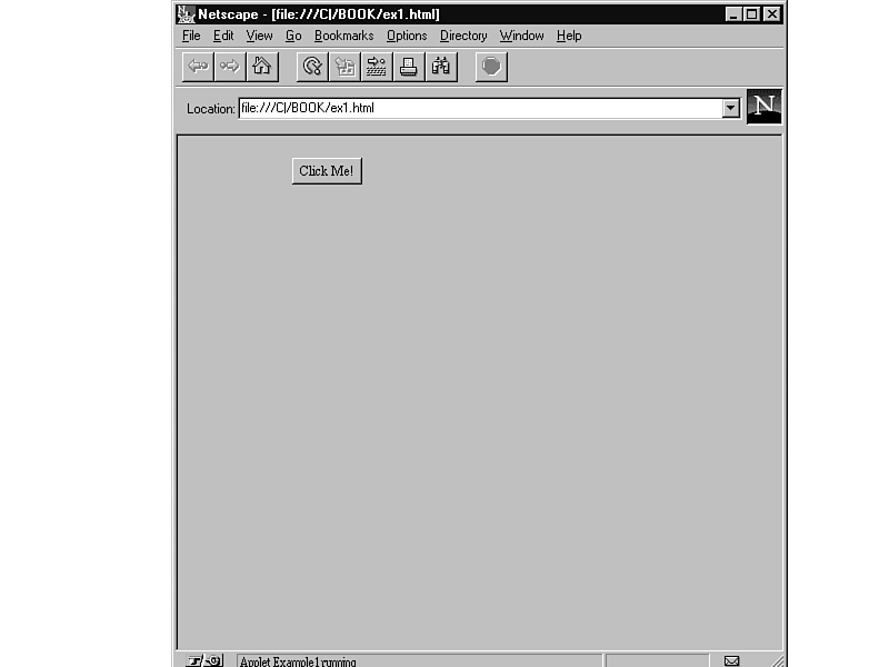
One of the most basic components is a button. Listing 11.1 shows the cod for a simple applet that uses the AWT to display a button.
import java.awt.*;

import java.applet.Applet;

public class Example1 extends Applet {

    Button hiButton;

    public void init() {

        hiButton = new Button("Click Me!");

        add(hiButton);

    }

}
The HTML for the applet is as follows:
<applet code=Example1.class width=250 height=100></applet>
When the code is compiled and viewed, the applet shown in Figure 11.1 is displayed. Although the applet doesn't do much at this point, the button is functional.
Figure 11.1. A simple applet that uses the AWT.
What is important at this point is not to understand exactly what every line means, but to get a general feel for what is going on:
For a windowing program that produces output, there is surprisingly little code here. Almost all the real work of handling the user interface is hidden behind the scenes. If you are using basic components, it's relatively easy to keep your code simple.
However, if you want to extend the functionality of the basic components, the complexity of your code increases.
When a component is created, it is usually added to a container. A container is an area of the screen in which components (and even other containers) can be placed. You can keep creating containers within containers indefinitely. The calculator
example at the end of the chapter demonstrates this type of flexibility.
This flexibility is one of the biggest advantages of programming the AWT. The AWT enables you to think of the user interface as objects and concentrate on the relationships between objects, a concept which fits well with Java's object-oriented
programming environment.
Programming any graphical interface can be a daunting task. Correspondingly, the AWT is one of the most difficult parts of Java to master. However, as long as you keep in mind a few basic tenets from the outset, the AWT is certainly manageable.
First, every viewable item in the AWT is subclassed from Component. Subclassing is just shorthand for "is inherited from"(inheritance is covered in detail in Chapter 9). This subclassing provides a core set of functions (things like setting
color) that work across all components. Look at the API documentation to check where the class you using is inherited from. Usually the function you are looking for is a step or two up the chain, hidden in a parent class.
Second, everything in the AWT is event-driven. Unlike many styles of programming, you construct your program to respond to user actions rather than proceed in a linear manner. Although this approach adds a level of complexity to your programs, it also
makes them much more usable.
Third, components are never placed on the page in absolute positions. Java was designed from the beginning to run on many different platforms and keep the look and feel of applets consistent with the operating system's native environment. The size and
precise shape of a button, for example, isn't known to an interface designer. Therefore, all components are placed inside containers that are relative to other components. Although this way of doing things seems strange at first, it is a very powerful
technique that will make your applications more robust.
 Note: If you've ever done Windows or Macintosh programming before, many of the underlying concepts are very similar to programming with AWT, especially if you've used a class library like OWL or MFC. The major
difference is simplicity. Most concepts in the AWT are much more straightforward than other development environments.
Note: If you've ever done Windows or Macintosh programming before, many of the underlying concepts are very similar to programming with AWT, especially if you've used a class library like OWL or MFC. The major
difference is simplicity. Most concepts in the AWT are much more straightforward than other development environments.
An event is a communication from the outside world to the program that something has occurred. The following are a few basic event types:
One of the most important things to understand about the AWT is how events are handled. Without events, your application cannot respond to user actions.
Listing 11.2 shows the code that adds basic event handling to the example from earlier in the chapter.
import java.awt.*;

import java.applet.Applet;

public class Example2 extends Applet {

    Button hiButton;

    public void init() {

        hiButton = new Button("Click Me!");

        add(hiButton);

    }

    public boolean action(Event evt, Object what) {

        if (evt.target == hiButton) {

            hiButton.setLabel("Clicked!");

            return true;

        }

        else

            return false;

    }

}
The HTML for the applet is as follows:
<applet code=Example2.class width=250 height=100></applet>
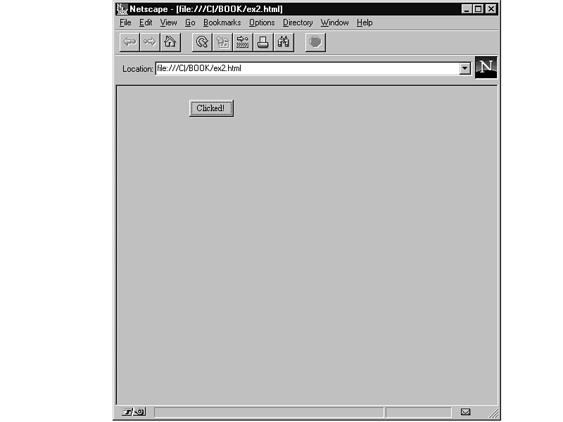
Figure 11.2 shows the output of the modified applet. All that has been changed is the addition of the action() method. When a component that has an action associated with it (for example, a button) is manipulated by the user, the action() method of that
component is called.
Figure 11.2. Adding simple event handling.
This example uses the default Button class instead of subclassing a new one. The default event handler tries to handle the action() event inside of the Button class, but cannot find a handler that will take the event. The default event handler then
passes the event up the chain of components to the container that holds the component. It keeps passing the event until it finds a handler that accepts the event or hits the top of the chain.
To understand exactly what's happening, look at the first line of the action() method:
public boolean action(Event evt, Object what) {
All event handlers have a form similar to this line. They accept a parameter of type Event that provides detailed information about the event. The action() method also takes a parameter of type Object(a generic object) that lets you know what action is
occurring. You can ignore this parameter in this example because there is only one possible action for a button. Lastly, event handlers return a boolean value indicating true if the event was handled or false if it was not.
The next line of the action() method is as follows:
If (evt.target == hiButton) {
In this line, the target of the event is being checked to see whether or not it is the button. Because evt.target and hiButton are both objects, you can check to see whether they are the same object.
The action() method then shows the following line:
hiButton.setLabel("Clicked!");
Because the button was clicked, setLabel is used to change the button to reflect that it was clicked.
The action() method ends with the following lines:
    return true;

}

else

    return false;
Finally, if the event was handled, true is returned. If the event wasn't handled, false is returned. The event handler keeps searching for a method that will accept the event. Acceptance of the event is signaled by returning true.
In almost all cases, you will want to use the event handling methods that Sun has provided for you. Table 11.1 summarizes these methods. Remember that everything is relative to the component. For example, the mouseMove() method of a component is called
when the mouse is moved inside that component.
Event Type |
Method |
|
Action taken |
action(Event evt, Object what) |
|
Mouse button pressed |
mouseDown(Event evt, int x, int y) |
|
Mouse button released |
mouseUp(Event evt, int x, int y) |
|
Mouse moved |
mouseMove(Event evt, int x, int y) |
|
Mouse dragged |
mouseDrag(Event evt, int x, int y) |
|
Mouse enters component |
mouseEnter(Event evt, int x, int y) |
|
Mouse exits component |
mouseExit(Event evt, int x, int y) |
|
Key pressed |
keyDown(Event evt, int key) |
|
Key released |
keyUp(Event evt, int key) |
When would you want to use methods other than action()? The answer is when you want to change the behavior of a component as opposed to just using it. The action() method only reports events that are essential to the function of the component, such as a
mouse click on a button. Listing 11.3 shows new behavior added to the preceding example.
import java.awt.*;

import java.applet.Applet;

public class Example3 extends Applet {

    Button hiButton;

    public void init() {

        hiButton = new Button("Click Me!!!");

        add(hiButton);

    }

    public boolean mouseEnter(Event evt, int x, int y) {

        hiButton.setLabel("Go Away!");

        return true;

    }

    public boolean mouseExit(Event evt, int x, int y) {

        hiButton.setLabel("Stay Away!");

        return true;

    }

    public boolean action(Event evt, Object what) {

        if (evt.target == hiButton) {

            hiButton.setLabel("Clicked!");

            return true;

        }

        else

            return false;

    }

}
The HTML for the applet is as follows:
<applet code=Example3.class width=250 height=100></applet>
Figure 11.3 shows the output of the applet. Whenever the mouse moves over the applet, the user is informed that perhaps clicking the button isn't such a good idea.
Figure 11.3. An applet with live feedback.
In most circumstances, you will only need to use action() to handle all the events in your applet. However, knowing how to handle things at a lower level gives you a great deal more control that can come in handy. Suppose you had an animation applet
that you wanted to only animate when the mouse was over it. The mouseEnter() and mouseExit() methods would enable you to program this action.
Components are the building blocks from which all programs using the AWT are built. Many other classes handle the components and the interactions between them, but if it's on-screen, it's a component.
All components have the following things in common:
AWT components can be broken down conceptually into three major categories:
Interface components are components specifically designed to give information to or get information from the user. The button used in previous examples is a prototypical example of an interface component. Table 11.2 lists the components available in
Java.
Component |
Explanation |
|
Button |
A clickable button |
|
Canvas |
A generic component, a blank canvas |
|
Checkbox |
A clickable box |
|
Label |
A simple text label |
|
List |
A list of things to select from |
|
Scrollbar |
A bar to scroll around a document |
|
TextField |
A one-line field to edit text |
|
TextArea |
Like a TextField, but allows multiple lines |
Earlier it was mentioned that straightforwardness was one of the hallmarks of the design of the AWT. Listing 11.4 demonstrates this fact with the code for an applet that uses multiple interface components. Figure 11.4 shows what this applet looks like
on-screen.
import java.awt.*;

import java.applet.Applet;

public class ManyComp extends Applet {

    Button aButton;

    Checkbox aBox;

    Label aLabel;

    TextField aTextField;

    public void init() {

        aButton = new Button("Ok");

        aBox = new Checkbox("Show");

        aLabel = new Label("Hello!");

        aTextField = new TextField("37", 5);

        add(aButton);

        add(aBox);

        add(aLabel);

        add(aTextField);

    }

}
The HTML for this applet is as follows:
<applet code=ManyComp.class width=250 height=600></applet>
Figure 11.4. An applet with many components.
The variable declarations in this example are pretty straightforward. To make sure you understand exactly what's going on, this section provides a line-by-line explanation.
The following line creates a button with the caption Ok:
aButton = new Button("Ok");
The next line creates a checkbox with the caption Show. A checkbox is a labeled box that can be checked on or off.
aBox = new Checkbox("Show");
In the following line, a label containing the string Hello! is created. A label is just text that is drawn on-screen, usually to clarify things.
aLabel = new Label("Hello!");
Finally, a TextField that contains 37 and allows up to five characters to display is created. A user can type in a text field, and text fields are one of the principal means of entering data into an applet.
aTextField = new TextField("37", 5);
The bulk of the AWT is subclassed from the Component class. Thankfully, the Component class contains a great deal of functionality that is available to all those subclassed components, as described in the following sections.
Color in Java is abstracted into the Color class, which has a number of static variables to represent color (see Table 11.3) and the capability to specify an arbitrary color with an instance of the Color object:
Color aColor = new Color(int r, int g, int b)
In this example, the r, g, and b are the red, green, and blue components specified in a 24-bit palette. In the 24-bit color palette, each color (R, G, or B) is represented by a number from 0 to 254. By specifying the value of each color, you can create
up to 16.7 million colors. However, if you want to use a fairly common color, such as red, Java provides some standard, pre-defined color variables, which are listed in Table 11.3.
black
blue
cyan
darkGray
gray
green
lightGray
magenta
orange
pink
red
white
You can set the foreground color of a component with the setForeground method:
setForeground(Color.green)
This code sets the foreground color of the component to green. The foreground color is usually what is being drawn. For instance, on a label, the foreground would be the text itself and the background would be what the text is drawn upon.
You can set the background color with the setBackground() method:
void setBackground(Color.black)
This code sets the background color to black.
A component can be turned on or turned off by setting it to enabled or disabled. To enable the component, use the enable() method:
enable()
To disable a component, use the disable() method:
disable()
When a component is enabled, it has all the functionality you would expect: a button can be clicked, text can be entered into a text field, and so on. When a component is disabled, a user cannot interact with the component at all. For example, an applet
that lets you calculate a loan might only let you click the Calculate button when all of the fields (amount, interestrate, and so forth) have been completed. Disabling the button until the applet checked the fields, and then enabling the button would allow
this control.
Containers are components that can contain other components, including other containers. Think of them as a way to subdivide the user interface into plots in which components can be placed or subdivided further.
The two general types of containers are panels and windows. The major difference between them is that a panel is a defined area on a window that already exists, and a window is an entirely new window. Also, the Applet class is a subclass of Panel, so an
applet can be treated just like a panel.
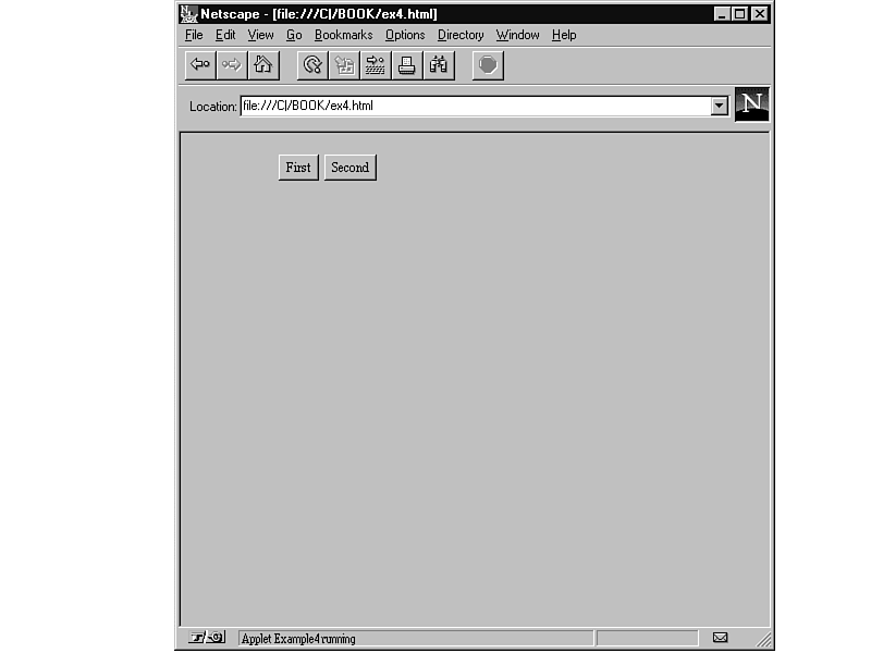
The example in Listing 11.5 uses the add() method to add components to the panel. Figure 11.5 shows the results.
import java.awt.*;

import java.applet.Applet;

public class Example4 extends Applet {

    Button button1, button2;

    public void init() {

        button1 = new Button("First");

        add(button1);

        button2 = new Button("Second");

        add(button2);

    }

}
The HTML for the applet is as follows:
<applet code=Example4.class width=250 height=100></applet>
Figure 11.5. A simple applet displaying two buttons.
After the component is created, all that needs to be done is to call the add() method for the container with the specified component. If your interface is quite simple, adding components to a container in this manner may be enough. However, if you want
to have some control over the placement of the components, you can use a layout.
A layout can be thought of as a template that is placed over a container to define how components will be added. The most common layout is BorderLayout(), which orients components according to compass points except that the center area gets all leftover
space. Table 11.4 lists all the layouts.
Layout |
Description |
|
BorderLayout() |
Layout according to compass points |
|
GridLayout() |
Layout on a grid |
|
GridBagLayout() |
Layout on a grid where elements can be different sizes |
|
CardLayout() |
Layout that contains a series of cards that can be flipped through |
|
FlowLayout() |
Layout that puts components left to right |
The layout of a panel is established with the setLayout() method, and then new components are added using the add() method with an argument indicating placement, which can be north, south, west, east, or center. This argument comes before the component
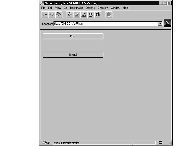
to be added. Listing 11.6 shows an applet that utilizes the borderLayout() method. Figure 11.6 shows the resulting applet is shown in.
import java.awt.*;

import java.applet.Applet;

public class Example5 extends Applet {

    Button button1, button2;

    public void init() {

        setLayout(new BorderLayout());

        button1 = new Button("First");

        add("North", button1);

        button2 = new Button("Second");

        add("South", button2);

    }

}
The HTML for the applet is as follows:
<applet code=Example5.class width=250 height=100></applet>
Figure 11.6. Demonstrating the borderLayout() method.
In addition to BorderLayout, the most commonly used layouts are FlowLayout and GridLayout. A FlowLayout places components onto the container one after the other, left to right, top to bottom. This layout does not allow much flexibility in designing a
user interface, but it is the most straightforward.
A GridLayout allows components to be placed one after another on a rigid grid. Although this layout sounds like the FlowLayout, it differs in that a GridLayout attempts to make all of the components placed on it the same size. Therefore, this layout
makes sense for things like keypads or a screen that needs to be divided into equal sections.
Suppose you wanted to create simple calculator applet. It would make sense to build the user interface first, and then add functionality one step at a time. A calculator would definitely require a display, so you could add that first using the code in
Listing 11.7.
import java.awt.*;

import java.applet.Applet;

public class Calculator extends Applet {

    Label display;

    public void init() {

        setLayout(new BorderLayout());

        display = new Label("0", 10);

        add("North", display);

    }

}
A BorderLayout makes sense in this example because the display will always be at the top of the screen. Adding the keypad is a bit trickier. The keypad needs 10 number buttons and 4 operation keys grouped together, which calls for a few more panels with
the appropriate keys added. Listing 11.8 shows how to manipulate the layouts to produce the applet shown in Figure 11.7.
import java.applet.Applet;

import java.AWT.*;

public class Calculator extends Applet {

    Label display;

    Panel bottom;

    Panel num_panel;

    Panel func_panel;

    Button number[] = new Button[10];

    Button function[] = new Button[6];

    public void init() {

        setLayout(new BorderLayout());

        display = new Label("0", Label.RIGHT);

        add("North", display);

        bottom = new Panel();

        bottom.setLayout(new BorderLayout());

        num_panel = new Panel();

        num_panel.setLayout(new GridLayout(4,3));

        for (int x=9; x>=0; x--) {

            number[x] = new Button((new String()).valueOf(x));

            num_panel.add(number[x]);

        }

        function[4] = new Button(".");

        num_panel.add(function[4]);

        function[5] = new Button("=");

        num_panel.add(function[5]);

        bottom.add("Center", num_panel);

        func_panel = new Panel();

        func_panel.setLayout(new GridLayout(4,1));

        function[0] = new Button("+");

        function[1] = new Button("-");

        function[2] = new Button("*");

        function[3] = new Button("/");

        for (int x=0; x<4; x++)

            func_panel.add(function[x]);

        bottom.add("East", func_panel);

        add("Center", bottom);

    }

}
The HTML for the applet is as follows:
<applet code=Calculator.class width=135 height=140></applet>
Figure 11.7. A first try at a calculator applet user interface.
The original panel has been subdivided twice. At the top of the applet is the label for the display; below that is a panel for all the keys. However, this panel must be again subdivided to group the number and function keys separately. Thus a number
panel and a function panel are added.
Because the lower panels contain keys, the GridLayout fits the purpose perfectly. This layout allows a grid to be specified and then components are added left to right, top to bottom until the grid is full. The function panel is then added to the East
(right) side of the lower panel leaving the rest of the space to the number keys. The number keys are specified to be Center and thus to use up all the space remaining in the panel.
This code provides a mock-up of how the final calculator would look and gives an idea of not just user interface considerations that will need to be considered, but also design decisions that are integral to the whole applet. For example, should all the
processing be contained in the main Applet class, or should the panels become separate classes to isolate functionality and promote code reuse?
This chapter covered how to go about building a user interface in Java using the AWT. Remember these key points:
If you keep these basic tenets in mind, you should be able to put together simple applets with a great deal of functionality. Just keep in mind how these pieces fit together and how they function together, you might even want to keep track of these in
writing while you work on your applets. Understanding how these pieces fit together and how they function with each other in your applet can keep errors in your interface to a minimum and make debugging them much easier.
Now you're ready for the big time. The following chapters take you through some real-world applets. Chapter 12 covers the TickerTape applet, which scrolls user-specified text on-screen. Chapter 13 covers the SlideShow applet, which allows users to set
up a series of images in a slide show, complete with a soundtrack.